Voigtlander Nokton Classic 35mm 1.4 II VM: is the new one better? A comparison
I decided to do a Nokton 35mm 1.4 comparison between the old and new version because I haven’t seen a detailed one online yet, and I would be interested in reading one if looking to buy either of these lenses. If you want to know how the Nokton 35mm 1.4 performs overall, regardless of which version, please have a look at the Voigtlander Nokton Classic 35mm 1.4 II VM review first. There are differences in image rendition, which will be examined in this article, but the main character is very similar; I will show the same picture taken with each lens to compare bokeh quality, sharpness, purple fringing, contrast, distortion, corner sharpness. The main difference should be less focus shift, which plagued the original and is supposed to have been tamed somewhat in the updated design. And that is one thing we will be looking into in this comparison: how much has it been tamed?
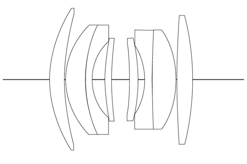
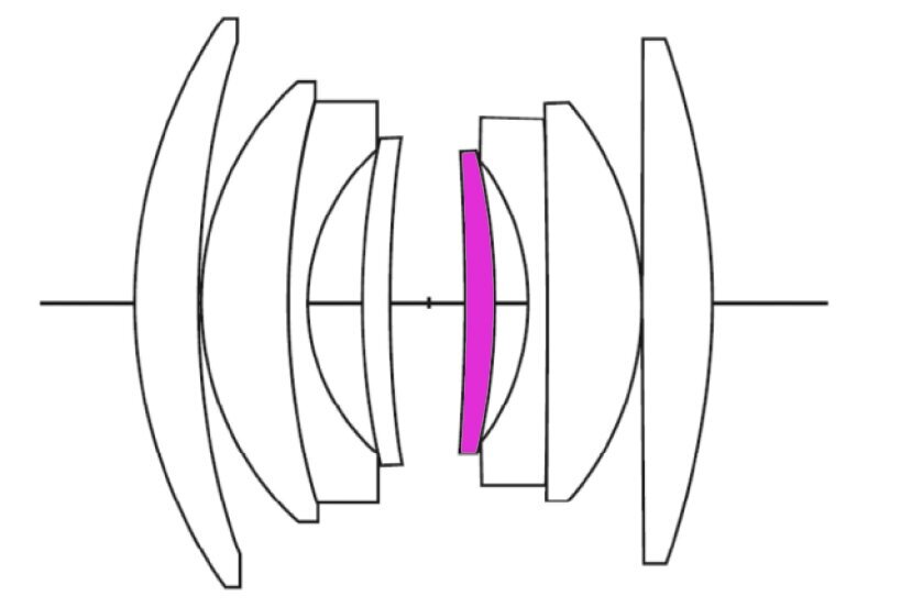
Let’s look at the difference in design between the two lenses:
What we see is that only one lens element (the purple coloured one) seems changed in both glass material (it is an anomalous partial dispersion glass in V2) and curvature for the less concave surface. Also, counting the lens elements from left to right, the 3rd, 5th and 6th elements seem to have a smaller radius.
Size and design of the barrel are almost identical:
Just for perspective I added the Voigtlander Ultron 35mm 1.7 Aspherical VM to compare sizes. The Nokton 35mm 1.4 on the left is V2, in the middle is V1. The only real physical difference I can see is in the aperture tabs: on V1 we find two non-diametrally opposite forward bent lips which copy the Leica Summilux 35mm 1.4 pre-aspherical design. In V2 the tabs become solid and feel much better in my opinion.
IMAGE QUALITY FIRST: ANY DIFFERENCE?
There will be some repetition from the review of V2, but in this instance those pictures will be compared with the same shots taken with the first version. Please feel free to click the test shots to see them bigger and to compare them!
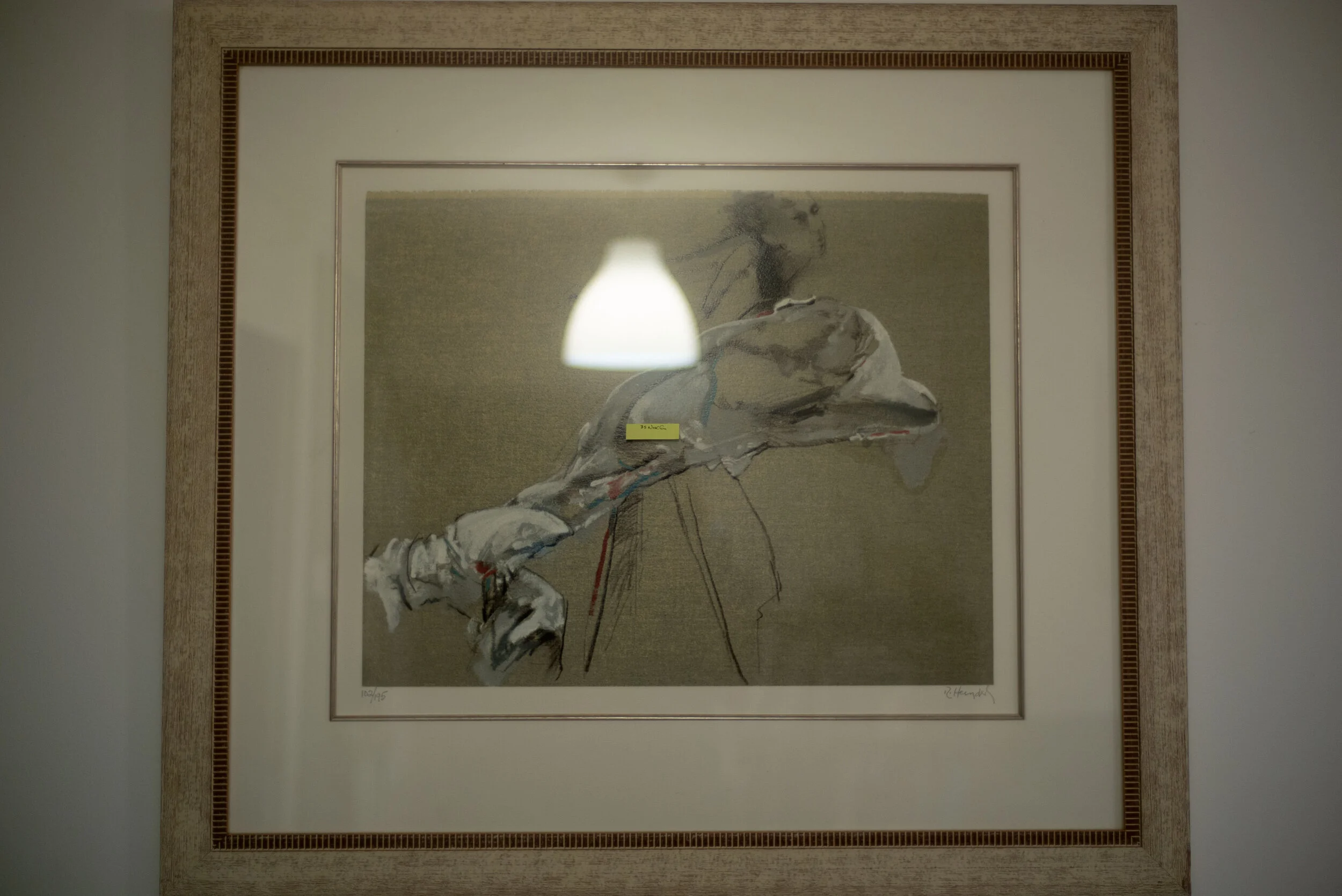
Let’s start with contrast, colour and bokeh. It’s a worthless picture but it gives some information:
Curiously the V2 shot seems exposed differently, slightly darker, but the settings were exactly the same. I also seem to notice slightly more contrast in the newer Voigtlander 35mm 1.4, and the colours seem slightly more saturated: could this be due to the higher contrast?
Same finding as before. It seems to me that the higher contrast in V2 makes the bokeh a bit more nervous as well, with more defined edges to the bokeh balls. Let’s go into more detail.
On the first version there is definitely more purple fringing. A lot more. That is still the case at F2, then at smaller apertures the differences cease to be relevant. On the other hand the V1 bokeh seems slightly softer edged: overall I prefer the out of focus rendition of the old design. It’s interesting to see how much more contrast the Nokton 35mm 1.4 II has, it’s very clear from these crops. I’m not sure there is a lot more detail, I think the contrast makes it appear so, but I think we are nitpicking at this point: it appears sharper and more contrasty. Is it actually sharper? I personally think it isn’t easy to judge from this picture: the subject was slightly moving in the wind, the plane of focus could be millimetrically shifted between the two sample pictures. We’ll have a closer look at sharpness below.
DISTORTION! HAS ANYTHING CHANGED?
Honestly I can’t tell if there is any difference. Both show a fair bit of barrel distortion. The Voigtlander 35mm 1.4 has always been known for it and its younger sibling seems to keep up with traditions here. As I said in the version II review I don’t find it to be a problem in daily use, but your mileage may vary according to your usual subject matter. Architectural landscape might not be the ideal genre for this lens!
NOW, FOCUS SHIFT: THE MOMENT OF TRUTH!
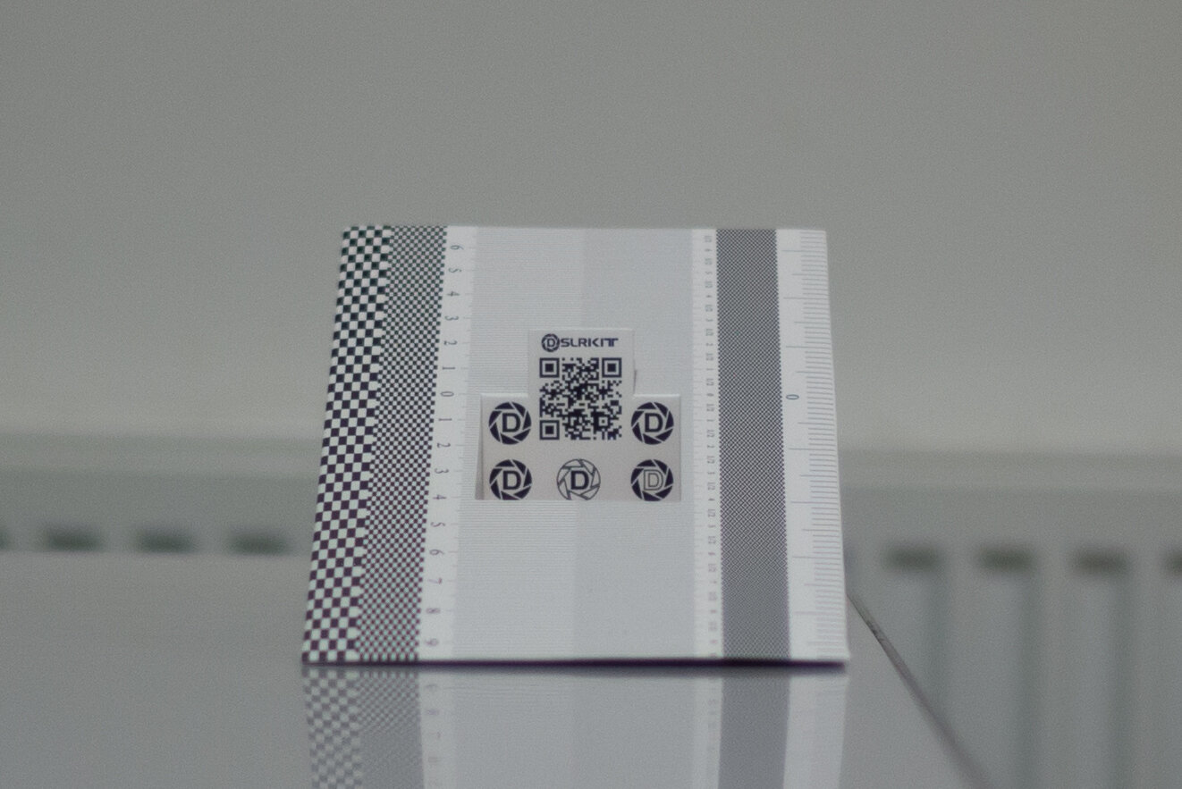
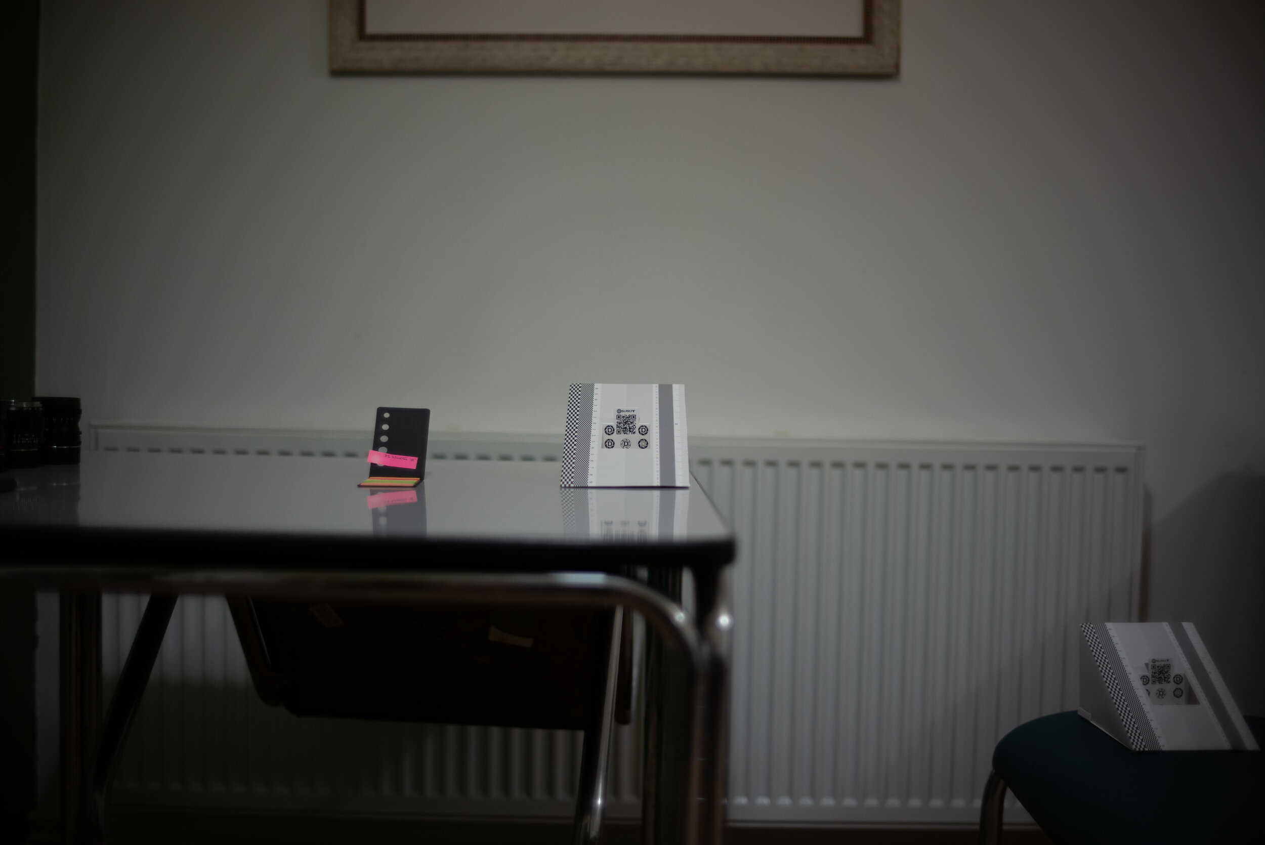
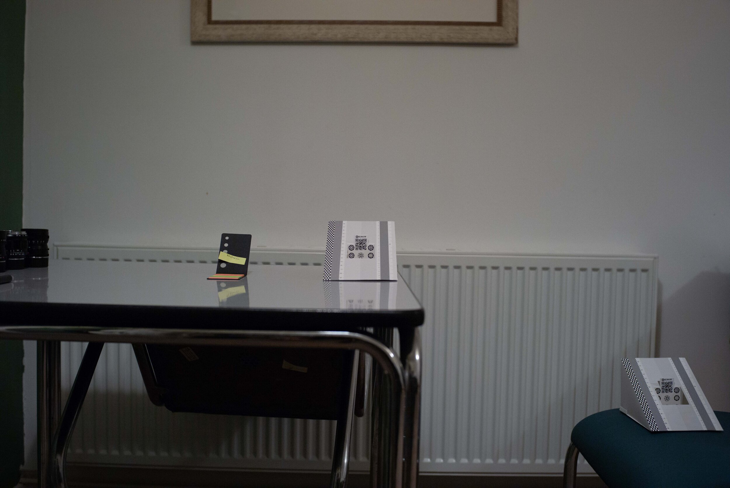
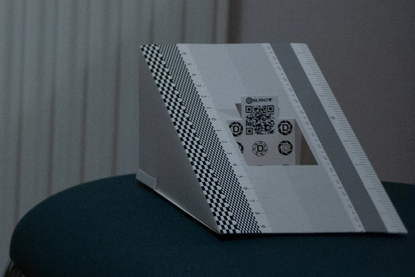
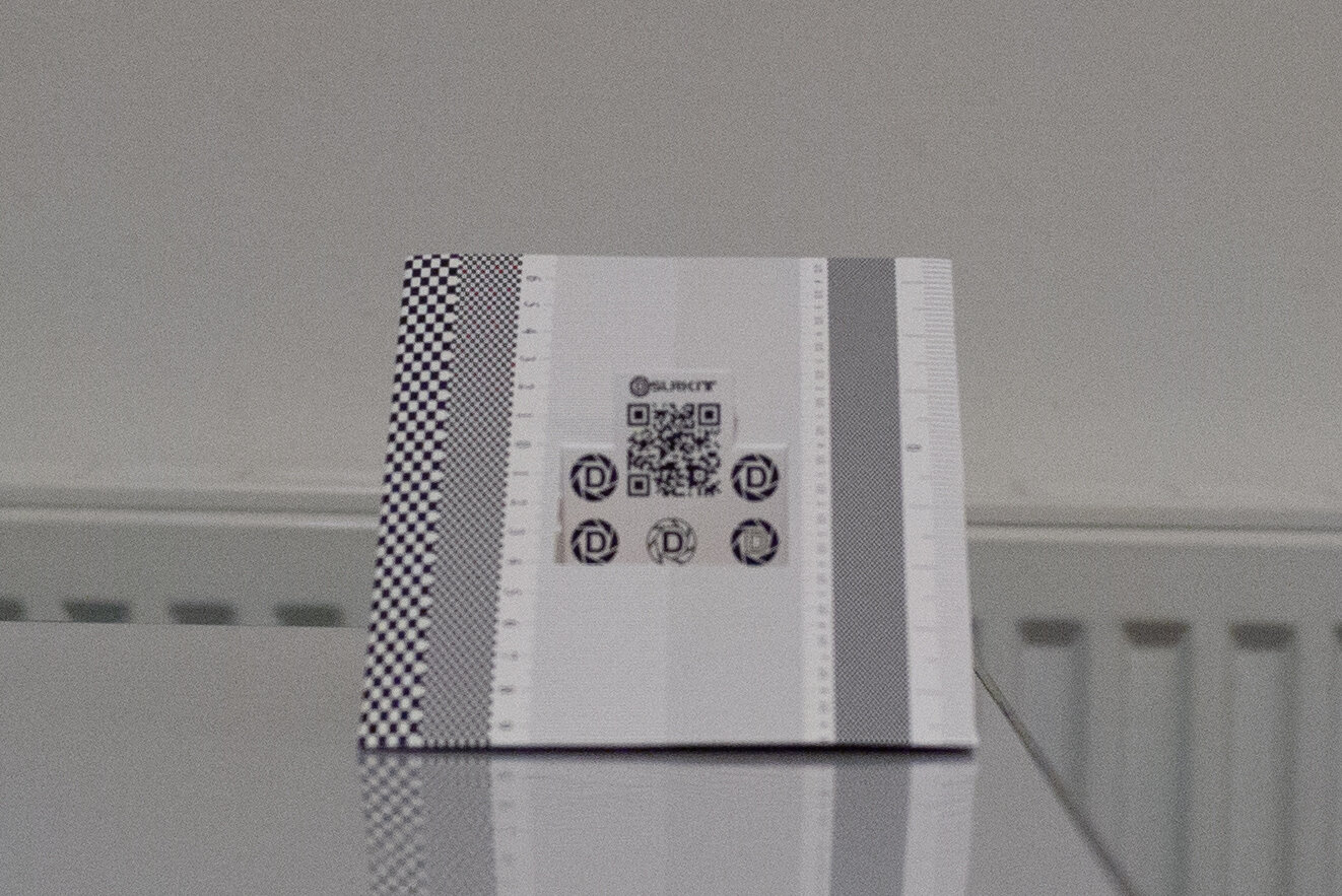
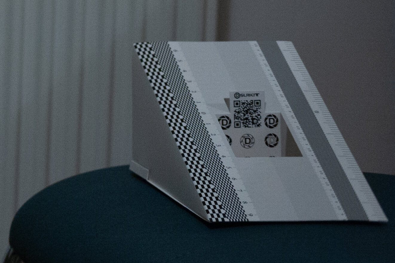
The focusing target is around two meters away. Camera on tripod, focused using electronic viewfinder and magnification, then changed aperture without touching focus anymore. Apologies for not having colour-balanced the V1 test shots! Please don’t draw conclusions on colour rendering from these pictures. Click the images for 100% view.
The differences are quite striking: first of all, the Nokton 35mm 1.4 II is slightly sharper wide open. But I have to say that the old design is plenty sharp wide open in real use: I’ll show a couple of sample pictures below to show that. Again we see the higher contrast for the new design. Closing the diaphragm we are seeing why Voigtlander redesigned this lens: the difference in focus shift is really impressive in my opinion, making the newer lens a lot more versatile in real world shooting. Stopping down to F2 there is already a noticeable amount of focus shift in V1, with the depth of field (DOF) moving almost beyond the focusing target. On V2 the shift is hardly noticeable. At F4 things are turning sour for V1, with the DOF moving completely away from the target and leaving some definition only to the very back of the focusing chart. I would judge the shift to be over 10cm/4in at least at 2m focusing distance. If we look at V2 the focus shift is now visible, but the DOF still covers the focusing target, albeit robbing it of some sharpness. When we close down to F8 we see that DOF hasn’t caught up completely with the focusing target yet on V1, leaving is slightly unsharp. Things are dramatically different for V2, where the whole focusing chart is tack sharp, front to back. I am surprised at the amount of difference! The Voigtlander 35mm 1.4 redesign has worked wonders for what I considered its major flaw. The claim that focus shift has been tamed is not unfounded.
VIGNETTING AND CORNER SHARPNESS
This is the setup with the focusing charts to judge the vignetting wide open and stopped down to F4.
If there is a difference it is negligible to me. Both lenses vignette heavily at full aperture. At F4 vignetting has all but disappeared for real world shooting purposes. Let’s now have a look at corner sharpness with some 100% crops.
Now that is surprising: V1 is consistently sharper in the corner at all apertures until F8, where V2 finally catches up! I was not expecting that! And another thing seems to be clear to me, as I mentioned in the Nokton 35mm 1.4 II review: the corner sharpness of this lens, and more so on the old design, is a lot better than you would expect. What deteriorates the corner definition is field curvature, which brings the DOF closer to the camera moving away from the centre of the image. Let’s just compare where the DOF is at F4 in the centre crop on V1, and then look at the corner crop at the same aperture, where the DOF is a lot closer to us: I will put the two images side to side here.
That’s a really sharp corner! Let’s look at the same for V2:
My takeaway from this is:
there is a field curvature that is convex in both lenses
both lenses are a lot sharper in the corner than expected, but not on the same plane of focus
focus and recompose should work well because the field might stay in the right place thanks to this kind of curvature
CONCLUSIONS, CONCLUSIONS
Let’s draw a list of strengths for each lens:
NOKTON 35MM 1.4 II
Slightly better contrast
Slightly sharper in the centre
Much less purple fringing
Vastly improved for focus shift
NOKTON 35MM 1.4
Softer bokeh
Sharper corners
Cheaper and plentiful on the used market
Overall I think this Nokton 35mm 1.4 comparison clears some doubts about the reasons for the release of a new design and the claims about focus shift having been tamed. There are bigger differences than I thought in the image quality between the two siblings, and they could be fitting different tastes. Possibly V1 could be preferred for a very vintage look and V2 a bit more of a compromise between a vintage and a slightly more modern image rendition? What makes the version 2 the clear choice for me is the big improvement in usability at all apertures, whereas in version 1 using the range between F2.8 and F5.6 could lead to some real disappointments both at close range and at medium distances, and it could make very tricky to nail focus on the eyes in portraits. Having said that when I used version 1 for a while it never failed me wide open, and at F8 on the street it works perfectly. But I’m not keen on lenses that have only two working aperture settings! With the Voigtlander 35mm 1.4 II I never had a misfocused shot that wasn’t my fault. It just never failed. This makes it a wonderful lens in my book, as long as you know what you are getting and have the right expectations (please refer to the review here).
Two very important things to consider: both these lenses were the multicoated (MC) version. Voigtlander always offered the Nokton 35mm 1.4 in both multi-coated and single-coated versions, for both V1 and V2. The single-coated (SC) offering should have an even more vintage look, with slightly less contrast and glare resistance overall. Secondly, this comparison has been done using a single sample of each lens. Thus sample variation has not been taken into account - you should ask Roger Cicala at Lensrentals to do so, he has several samples of each lens usually! Do check out his blog, really interesting even for geeks!
SAMPLE IMAGES FOR THE NOKTON 35MM 1.4 VERSION 1
Keep in mind these are mainly sample shots to show how the lens works, they are not artwork I’m particularly proud of!
To see sample images for the version 2 have a look here - there are quite a few!
Please let me know what you think in the comments!
Previous comments:
I can see that you have those 3 lenses that I'm interested in.
How do you like V2 version comparing to the Voigtländer Ultron 35mm f/1.7?
Flavio Admin Thai Hoang • 7 months ago
Hello Thai, I used all three lenses and ergonomically the Nokton is best. But everything else is better on the Ultron. If you’re ok with the Ultron ergonomic you won’t regret getting that lens, it’s incredible. Hope this helps. Stay tuned for an upcoming review in the next month or so!
Great review, thanks so much. A lot of people bought the version 1 for the incredible circular flare it produced when shooting in direct sun light. Do you know if this remains in the version 2 or if they tried to reduce that phenomenon ?
Flavio Admin Steven • 5 months ago • edited
Hi Steven, thanks for commenting. I have to say that I never noticed the circular flare you mention and will now look that up! I found both lenses to be quite flare resistant apart from specific angles of incidence of the light. I don't have the lens with me to test though...I'd be really interested in finding out.
Would you be able to point me to a source for that circular flare? Thanks!
You will love it. It’s the most famous lens to get for flare hunters
Vital Sinkevich • 2 months ago
Hi. thanks for your article! I'm about to get Voigtländer Nokton 40mm f/1.4 for my Bessa film camera. But found a bit frustrating that there are a few versions of Nokton been manufactured. There are some without any letters that list S.C or M.C I presume they are single-coated? Thanks in advance
Flavio Admin Vital Sinkevich • a month ago
Hi Vital, thanks for kind words.
From my experience Voigtlander doesn't write anything on the front ring of multicoated Nokton 35mm lenses, you have the S.C. designation only on the single coated. I presume the 40mm 1.4 will be the same.
To add to the confusion my Nokton 50mm 1.5 II is a multicoated version and it does have the M.C. designation! But I guess it is a new thing...hope this helps!!Vital Sinkevich Flavio • a month ago • edited
thank you so much, Flavio!


