Zeiss C Sonnar T* 50mm 1.5 ZM review
I always had an attraction towards this lens but always wished for different optics in it. That’s why I never bought it until I decided to do my big 50mm lens comparison. This design appeared on the market in the 1930s, and Zeiss released it again with newer lens coatings and minor modifications in 2004. The optical design is not modern and it shows: my main issue with this fast prime lens is its pronounced focus shift, a known characteristic in the Sonnar aficionados community. To understand more about what focus shift is please refer to this article of mine. For a closer look at the specifics on the Zeiss C Sonnar in particular please check this article by Brian Sweeney, he is a wealth of information on Sonnar designs!
The Sonnar design and the Zeiss C Sonnar in particular have a cult following. Why? Apparently Sonnar optical designs have a very particular rendering that is looked for and loved by a large number of photographers. The bokeh rendering is one of the peculiar characteristics of these lenses, but there must be more. Let’s look into it.
A few months ago Voigtlander released the Nokton 50mm 1.5 II. I reviewed it here and it is in the comparison with the Sonnar 1.5. I mention it because it has the diminutive size and same speed of the C Sonnar (actually it is 20% lighter and even shorter!) and it has a very high optical quality. I chose that lens without hesitation over the Sonnar. Why? I will publish a direct comparison between these two lenses to highlight their differences.
Table of Contents
Handling
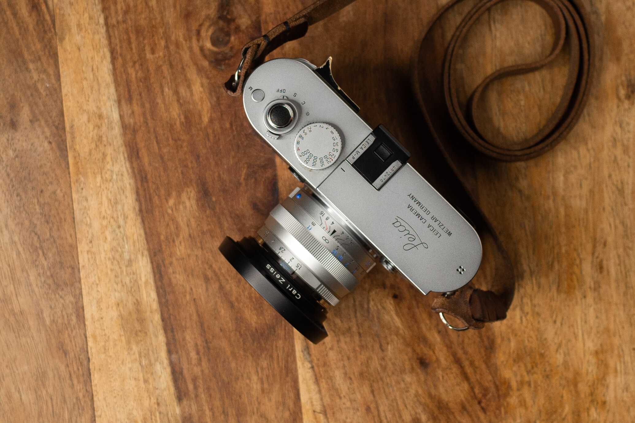
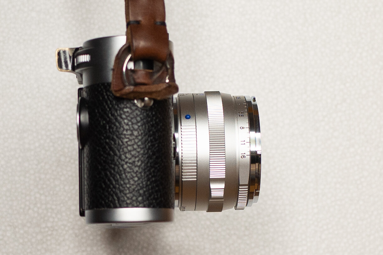
This fast prime lens has fantastic handling, even better than the Voigtlander Nokton 50mm 1.5 II: it is small and short (38.2mm), doesn’t block the viewfinder unless you use the hood, which is a bayonet design and works well. Unfortunately the hood is not included with the lens and has to be bought separately. The weight of 250g balances it perfectly on the camera. The lens feels well built and solid. It’s made of aluminium alloy. The focus ring resistance is perfect. It has a 90 degrees travel and has a fine knurling that is a pleasure to use. The Zeiss ZM line of lenses have a bump on the focus ring where a focus tab would normally be. This allows the focus to be achieved easily with a single finger, like with a tab, and to have a tactile index for the focus position without having to look at the lens. I usually ignore it and it doesn’t disturb me at all. A tab would be a lot more intrusive (I really like focusing with a knurled ring more than with a focusing tab). The aperture ring is knurled around roughly 120 degrees of the circumference, with a smooth area where the aperture values are displayed on top. This allows for the knurling to be always and easily found under the lens, no matter the starting position, so you never fumble to find and move it. The third stop spacing for the aperture values instead of half stops like all other lenses for the Leica M mount is a minor annoyance: it just makes it a bit harder to quickly count clicks to get the right value without looking. All Zeiss ZM lenses have this, since they were manufactured for the Zeiss Ikon ZM rangefinder film cameras. The ring feels solid with firm detents. This lens is lovely ergonomically and a joy to handle.
Is the sharpness any good?
Any time you talk about the Zeiss C Sonnar T* 50mm 1.5 ZM with a fan of the lens you will hear that this lens is not about sharpness or high image quality, it is about the magical rendering. Does this mean that it just doesn’t have high image quality? Let’s see.
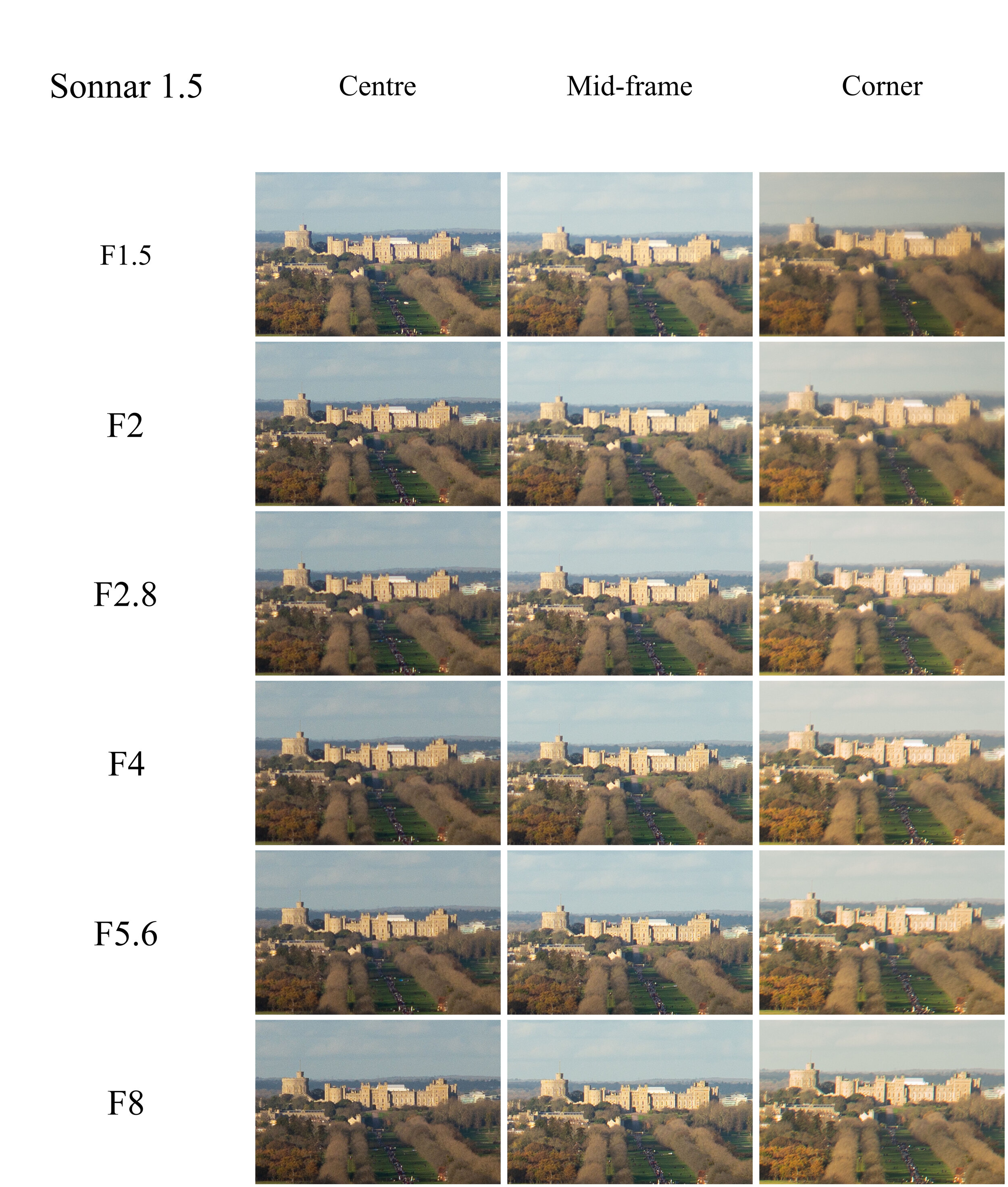
We will start with sharpness at infinity with centre, mid-frame and corner crops. Here is the test frame:
DISCLAIMER: the crops we will be analysing are 300% crops. Why 300%? Because it’s nice to see the castle filling the crop. This is pixel-peeping to the extreme. Take it for what it is, in real photography you will hardly see the minute nitpicks we will be talking about here!
With that out of the way, let’s have a look at the crops:
Clicking on the grid will open a new tab with the Flickr version which is less compressed and easier to enlarge.
The difference in exposure is given by the fact that the mid-frame and corner crops are obtained reframing the scene to position the castle in the appropriate place in the image. Because the camera was pointing lower and left, into the grass, the exposure was a bit lighter - I left the camera on aperture-priority for the test assuming it would be saving me some work. I was wrong, I should have done it manually as usual!
Centre crops:

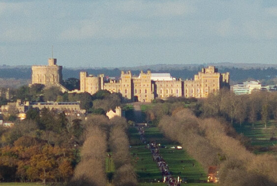


After all that jazz about the lens being soft and an old design, have a look at the wide open shot: remember, it’s a 300% crop! For a 90 years old design, wide open at F1.5, this is really great, even taking into account small modifications to the design and new lens coatings for the modern market. I’m impressed. Contrast is a bit low but there is plenty of detail. At F2 the contrast has improved but I don’t see more detail, only some improved edge- and micro-contrast. At F2.8 and F4 the detail has become very soft and mushy, starting to come back at F5.6 and getting to roughly F2 levels at F8. That is surprising! Is that the fabled focus shift? If so that is quite sobering to see. So much of it even at infinity!
Mid-frame:


Mid-frame is a whole different kettle of fish! Wide open and at F2 it’s soft and mushy, with a slight improvement in the low contrast levels at F2. Some detail is creeping in at F2.8 and the image is getting quite good at F4. At F8 the detail is really good and there is a little more micro-contrast.
Corner crops:


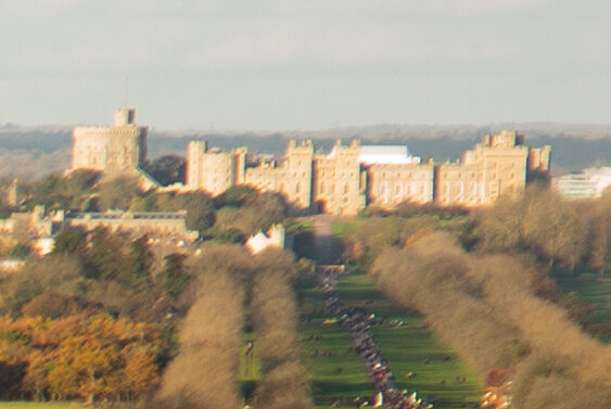
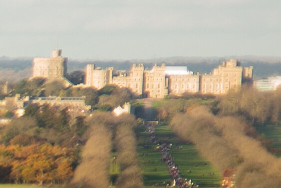
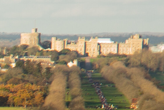
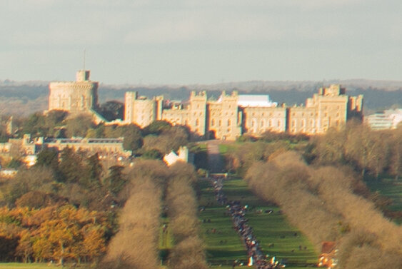
Wide open the corner is plainly bad. There is detail in there, but it is masked by a really hefty amount of what seems spherical aberration and lateral chromatic aberrations (LaCA), which will get more visible at F2.8. At F4 the prodigious levels of LaCA are plainly visible, splitting the edges of the castle in green and magenta fringes. F5.6 loses detail again but recovers it at F8. Not a good performance at all.
Let’s see all the shots together to see the progression from centre to corner at each aperture value:


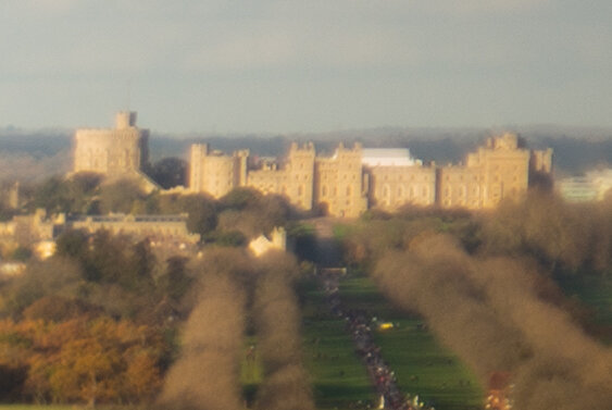


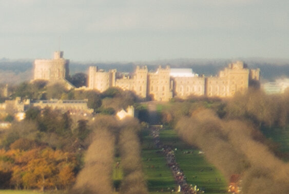


Well, it is a 1932 design and it shows, even if slightly modified for modern times. While pretty sharp wide open in the centre it gets pretty fuzzy from F2.8 to F5.6, getting better again at F8. The mid-frame gets decent at F5.6. The corners are just a bit nasty.
Let’s look at the Minimum Focusing Distance and magnification: this lens has a MFD of 0.9m, which is not great in the rangefinder world. The actual rangefinder mechanism doesn’t go closer than 0.7m because of parallax issues. The MFD is 0.7m on most lenses as a standard, and having even less close-up ability is definitely a negative.
The subject of the test is a camera battery measuring 55x37mm. I carefully refocused the lens for each shot to avoid the focus shift issues, which we will examine later. The first image is the full frame, followed by 100% crops.
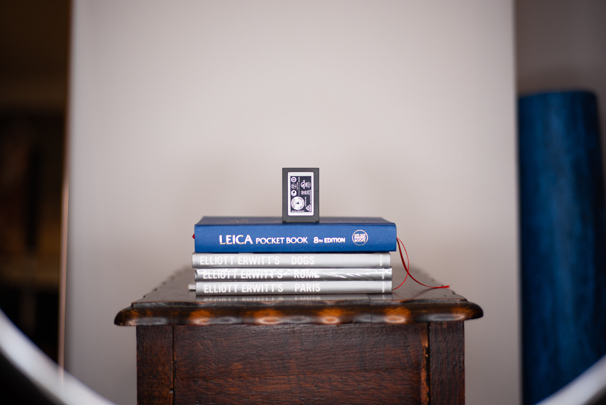
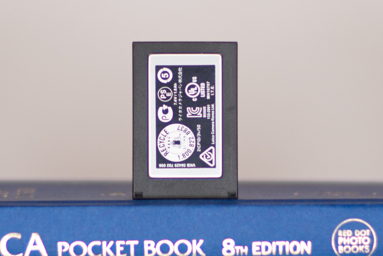
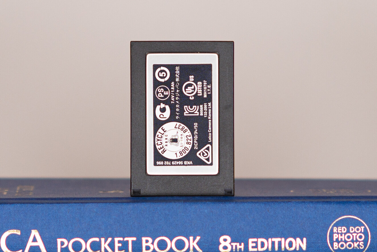
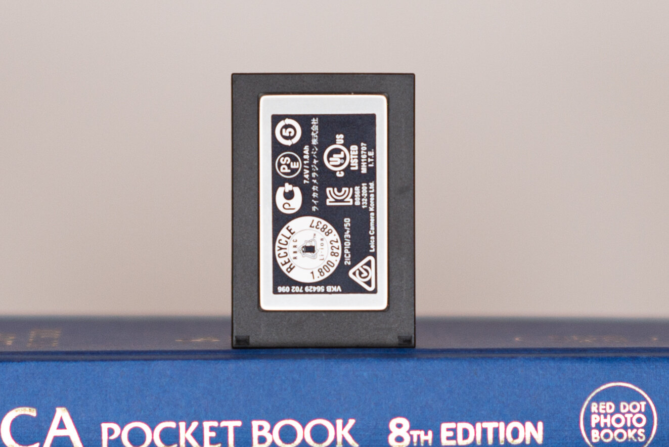

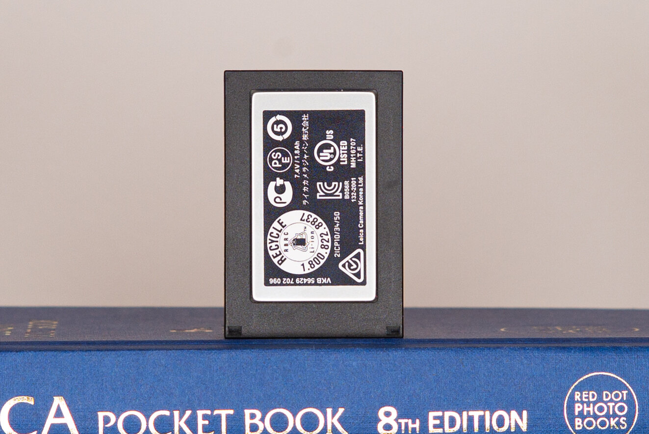
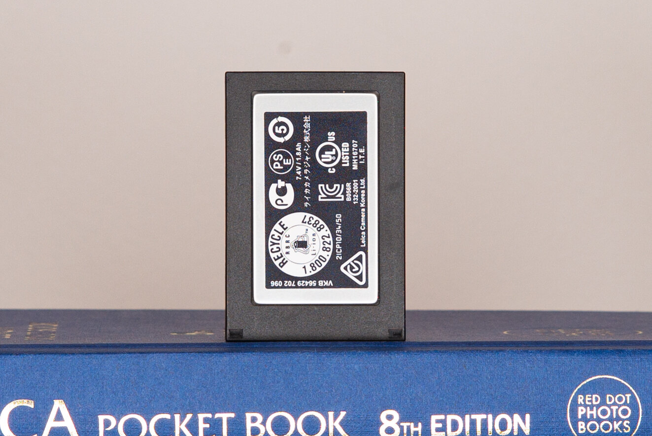
Wide open the detail is not particularly sharp and there is an inordinate amount of longitudinal chromatic aberration (LoCA), tinging every detail with red and blue. At F2 the LoCA has been brought to heel but the definition is not crisp. At F2.8 the detail is definitely improving, although there is a slight red LoCA fringing all over it. F4 is starting to look really good, the peak is at F5.6 before some diffraction creeps in at F8.
Not a macro lens obviously, but capable of good definition at MFD. Shame that without a live view enabled camera this performance won’t be available because of the focus shift.
Speaking of which:
Focus shift: how bad is it?
This is the moment of truth for the Zeiss C Sonnar T* 50mm 1.5 ZM. Does it really shift so much?
Clicking on the grid will open a new tab with the Flickr version which is less compressed and easier to enlarge.
Let’s see the centre crop:

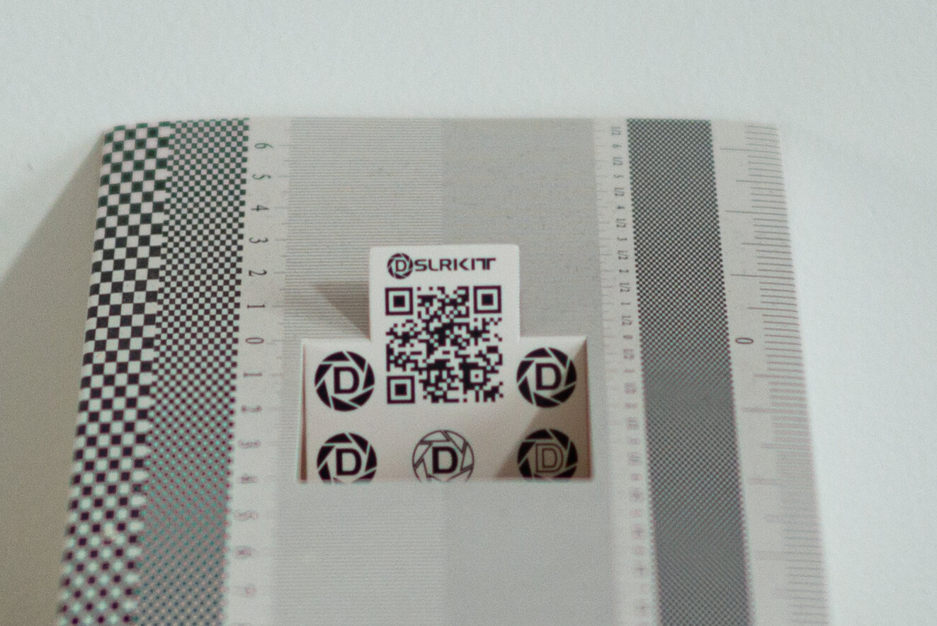
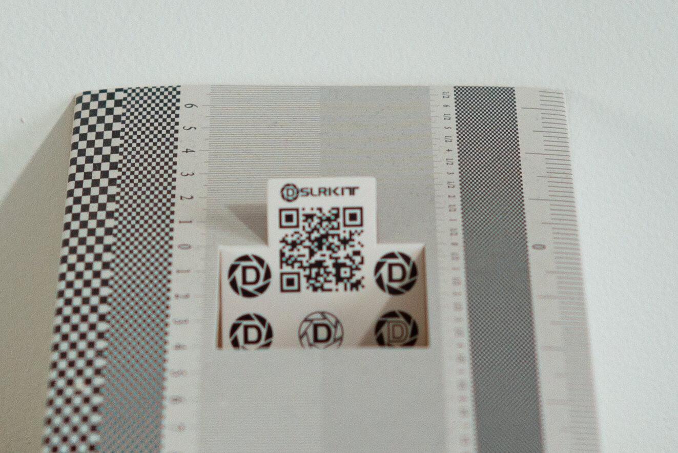
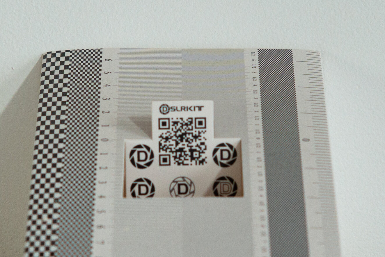
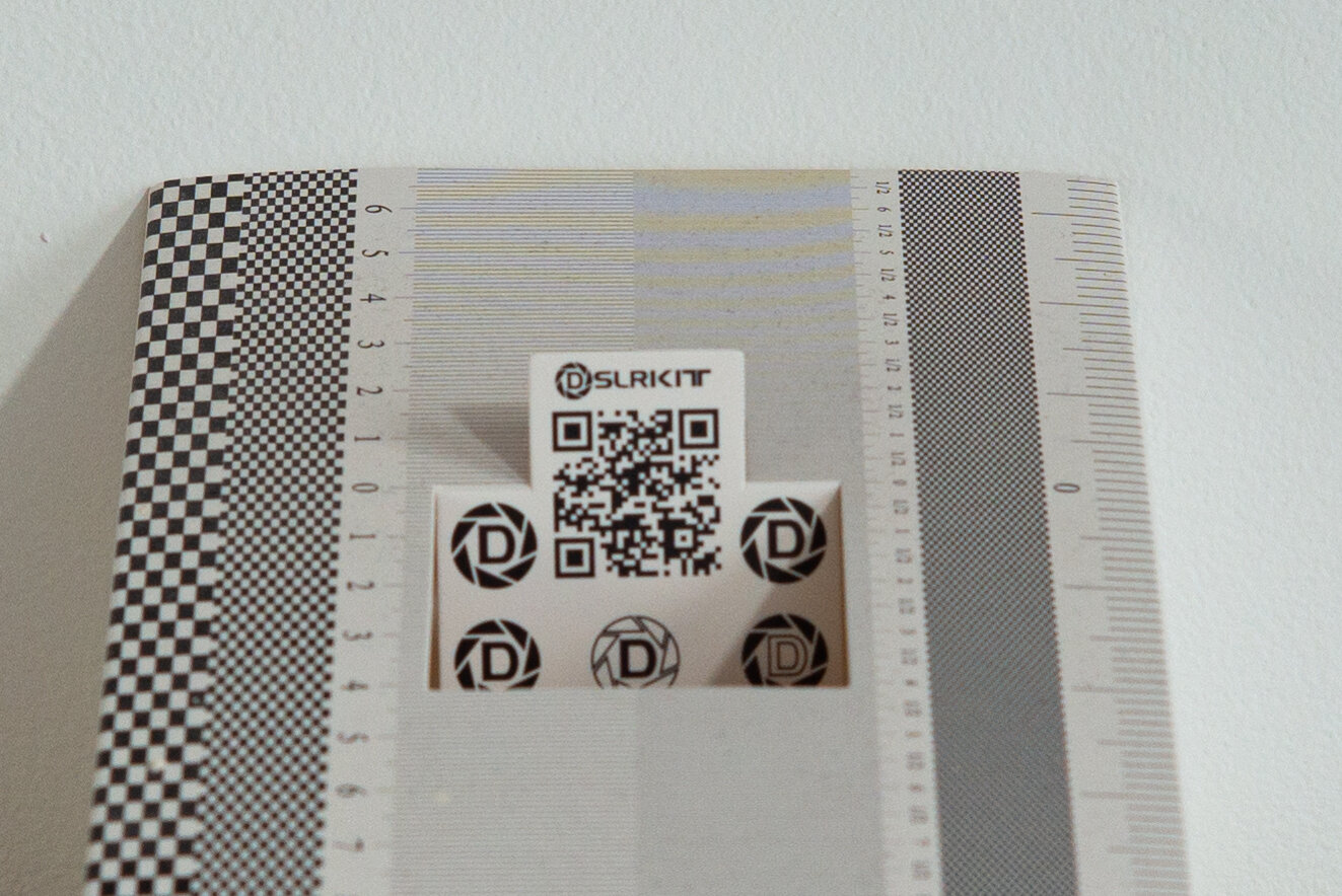

Wide open we can see a hefty amount of uncorrected spherical aberration making the out of focus details behind the plane of focus still quite well defined within the spherical blur: the lines and numbers should be totally blurred at the further end of the focusing calibration device, but they are really well defined with a “glow”around them. Also, there is a moderate amount of spherochromatism, a form of LoCA, tinging the out of focus high contrast transitions of green behind, magenta in front of the focus plane.
At F2 the focus plane has already moved backwards by 2cm. That is a massive amount of focus shift for just one stop from wide open! The target is already losing definition because it is already outside of the depth of field (DoF). At F2.8 the focus plane is 4cm beyond the target, which is now quite fuzzy. At F4 we are in la-la-land. The plane of focus is outside the focusing calibration device, the acceptable sharpness DoF starts more than 3cm beyond the intended target. At F5.6 the DoF keeps on getting deeper but it barely manages to reach backwards a little, starting now almost 2cm beyond target. At F8 the target is finally getting sharper again, falling just at the edge of the acceptable sharpness DoF.
Let’s have a look at the mid-frame:
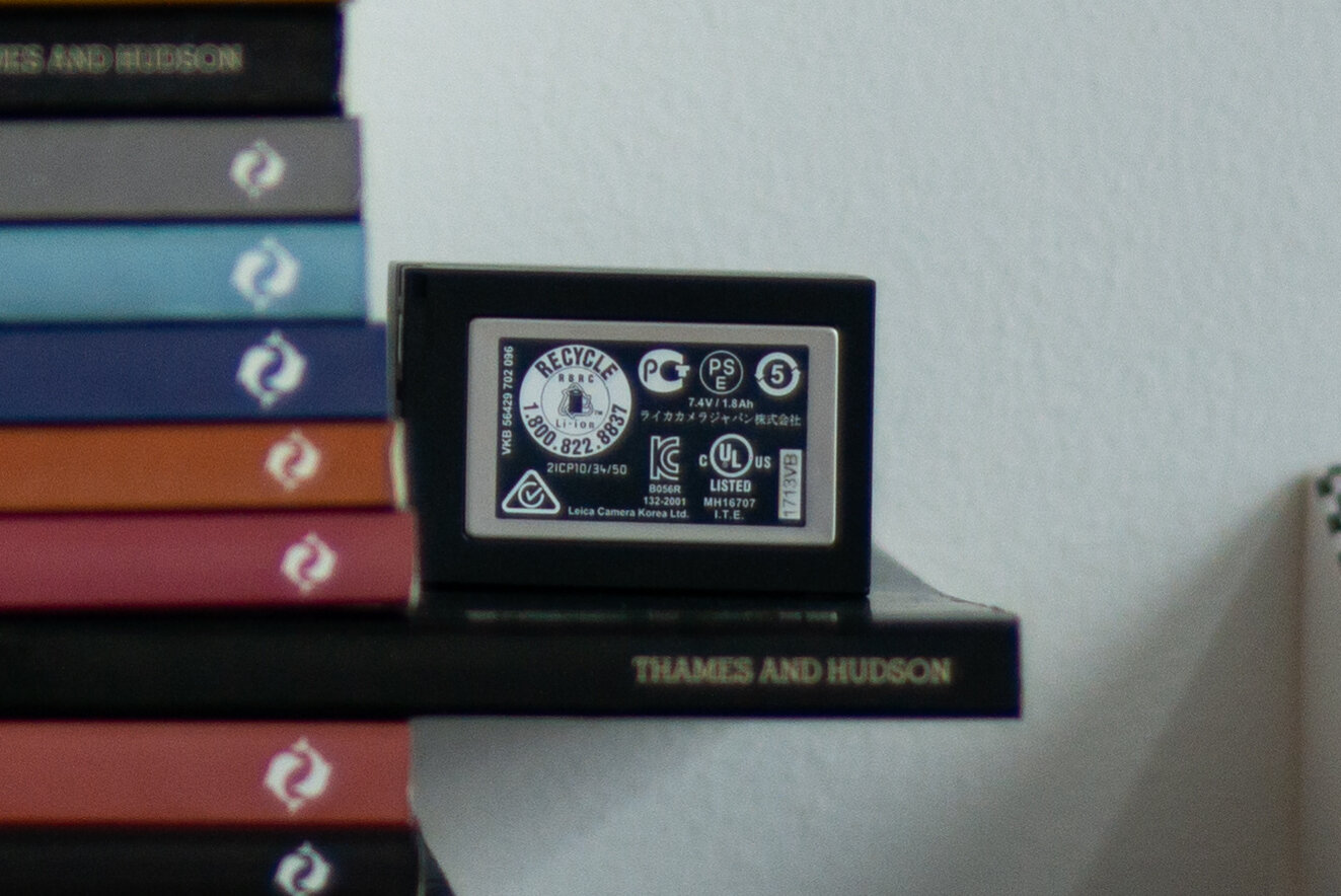
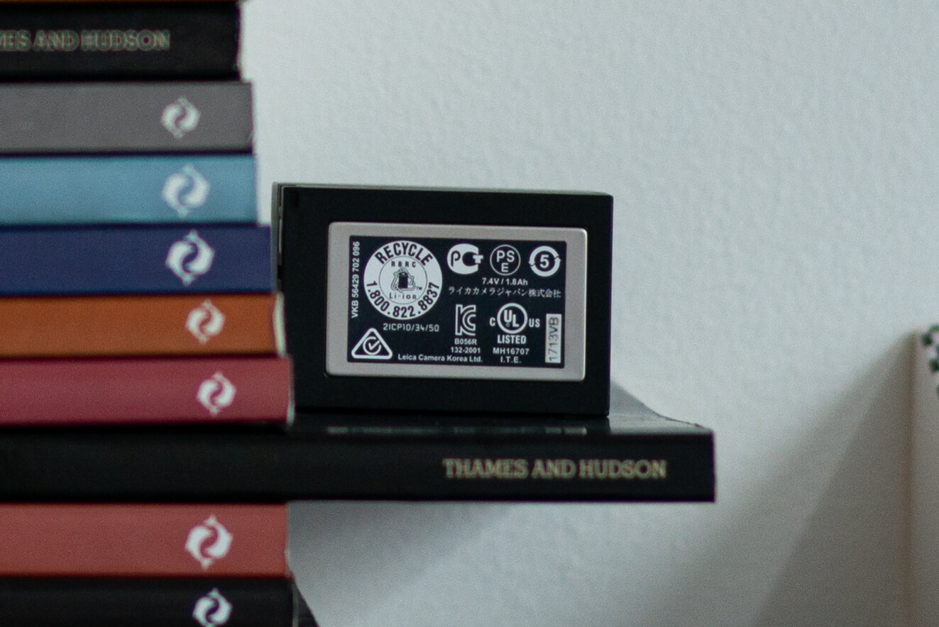
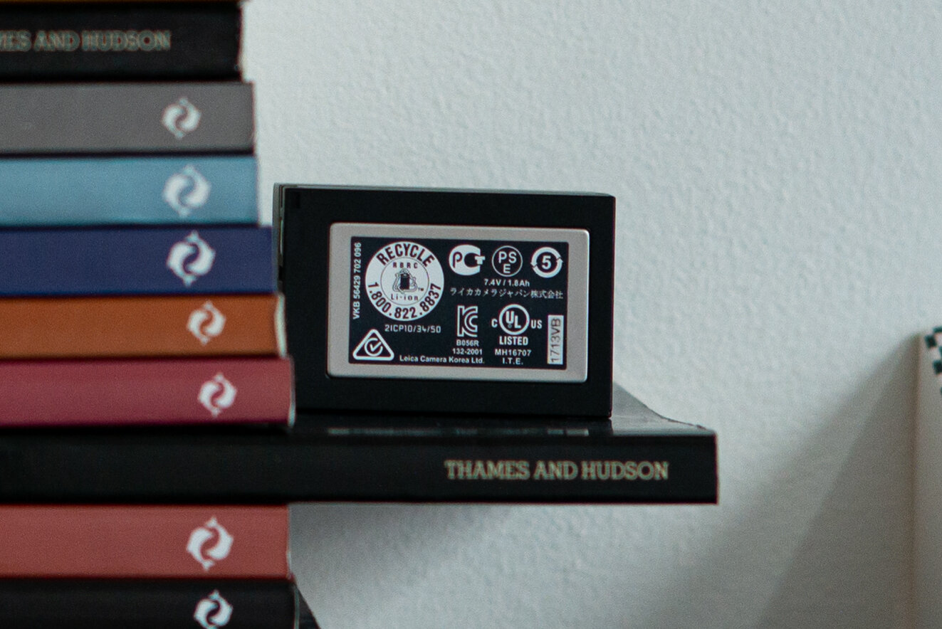
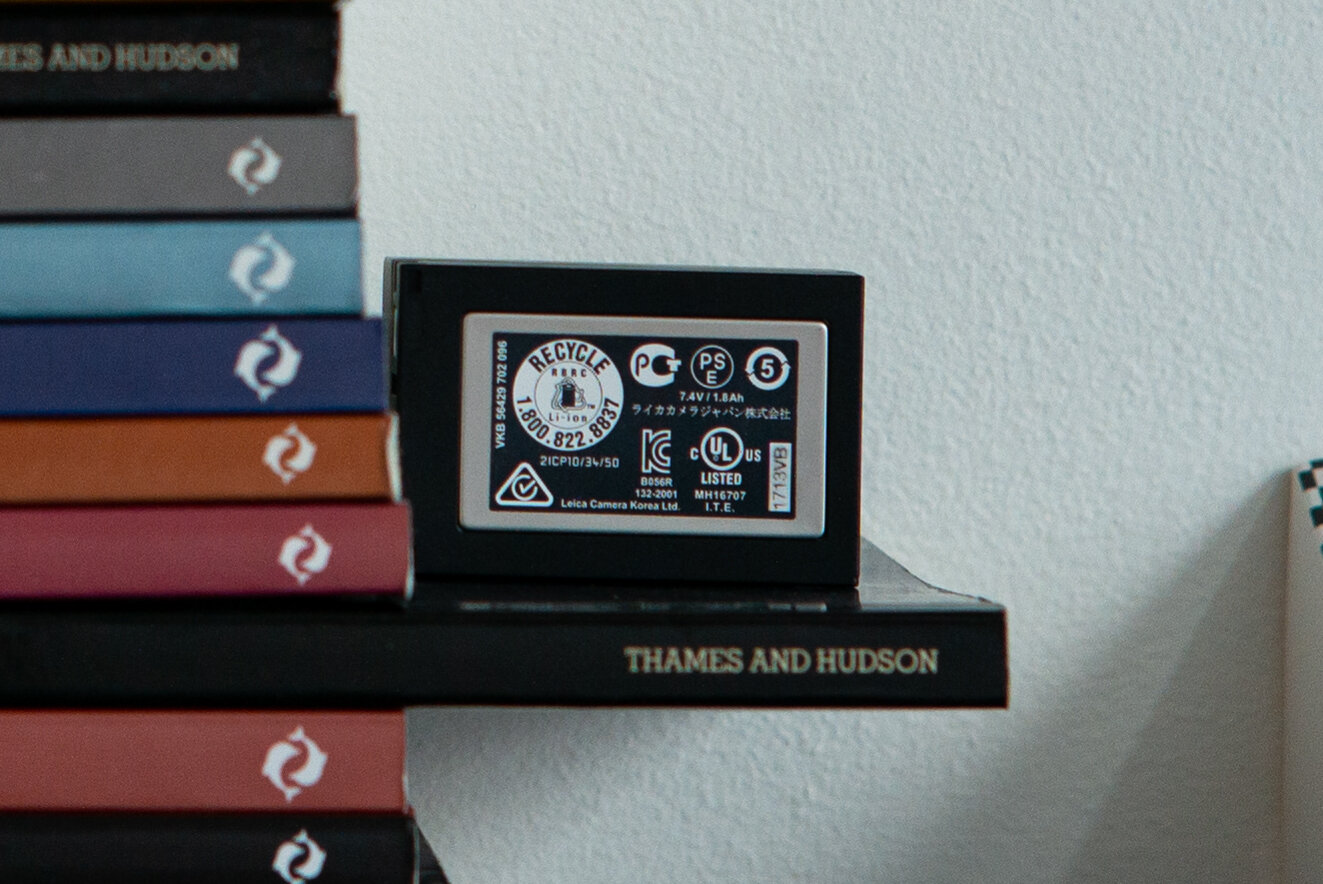
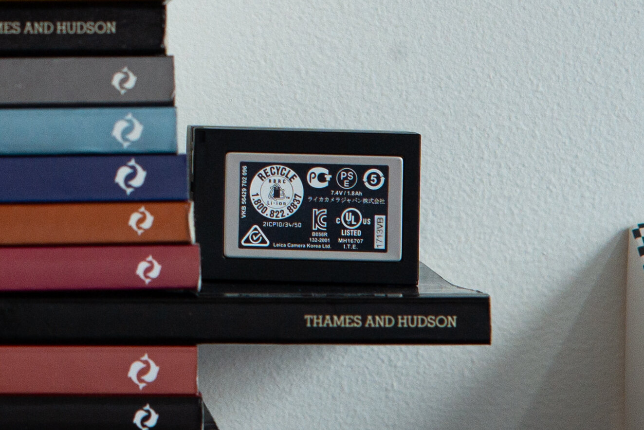
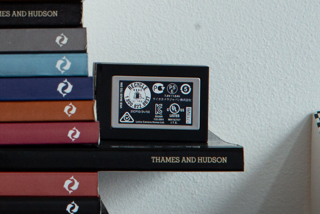
Wide open we can see a healthy amount of spherical aberration again. It improves at F2 and gets quite good at F2.8. It’s interesting to observe that the focus shift issue is barely perceptible in mid-frame, although there. At F8 the image is quite defined. Throughout the aperture range from F2.8 we can see quite some LaCA with blue and red fringing.
Corner:

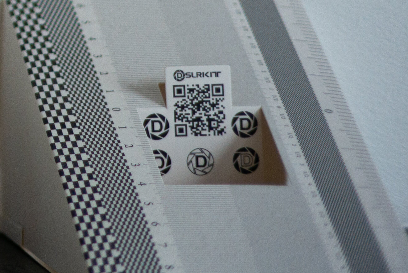
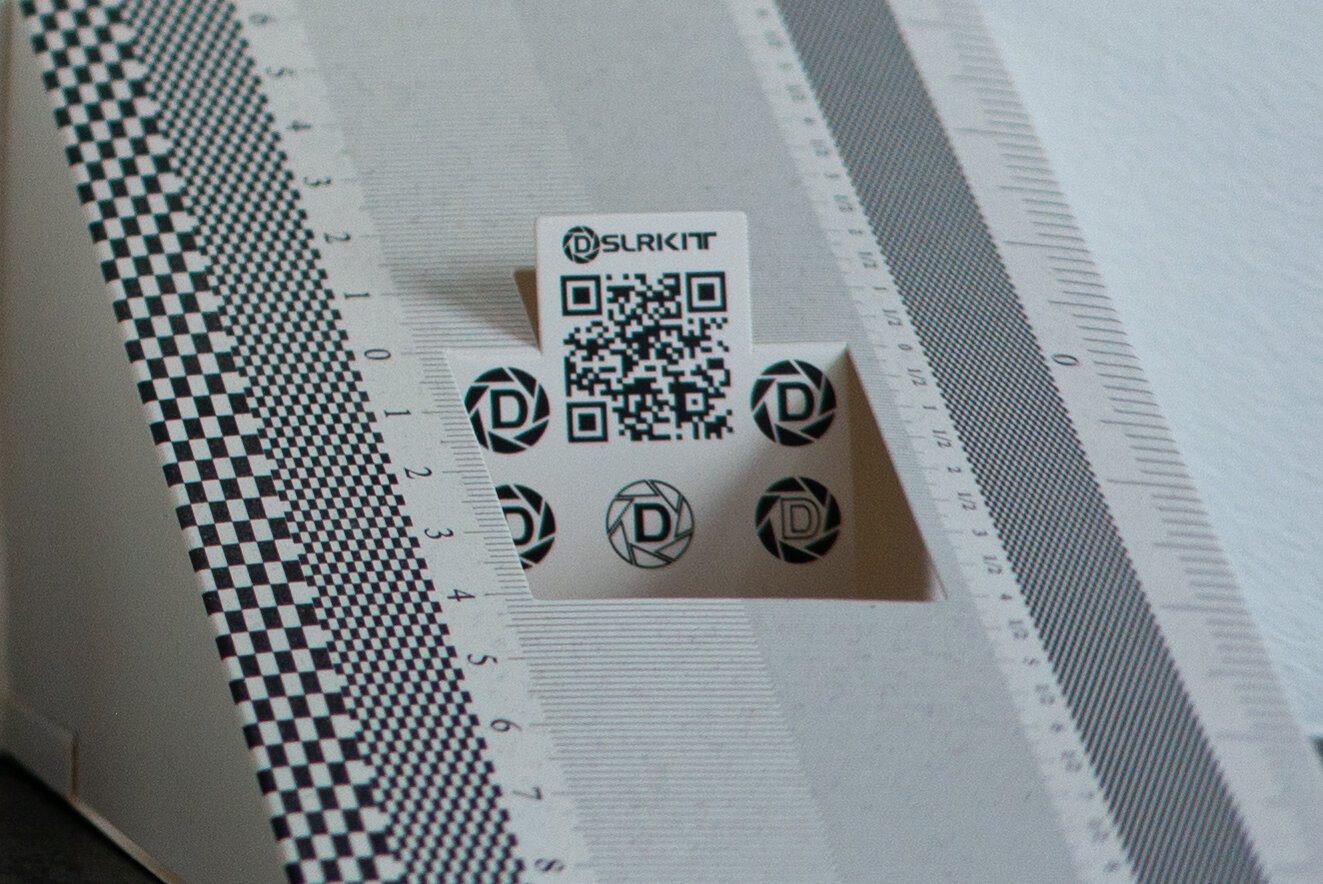
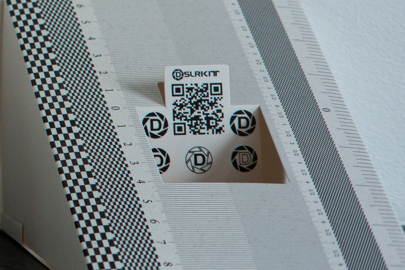

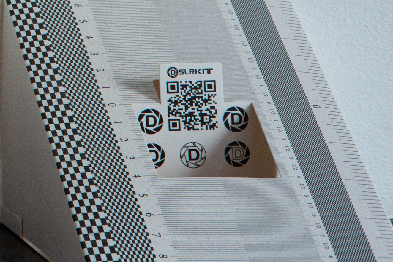
There is a pronounced positive Petzval field curvature: the plane of focus is in front of the target throughout the aperture range, no matter the heavy focus shift behaviour in the centre of the frame. There is a fairly linear improvement of the image in the corner with stopping the lens down, from moderately fuzzy wide open to really sharp at F8. Again the blue-red LaCA fringing becomes very visible from F2.8.
The Zeiss C Sonnar T* 50mm 1.5 ZM clearly shows the nature of the Sonnar optical design: focus shift in spades. It isn’t very sharp wide open (hey, it is a 1932 design!) but it just worsens stopping down, with the focus plane running away so fast that the DoF never manages to fully compensate for it. If you need sharp and accurate close focus images with a stopped down Zeiss C Sonnar on a Leica M? Forget it with unless you use live-view on the latest models.
Coma, astigmatism and sunstars
This is the image we are assessing, the same used in the same test for the 50mm comparison:


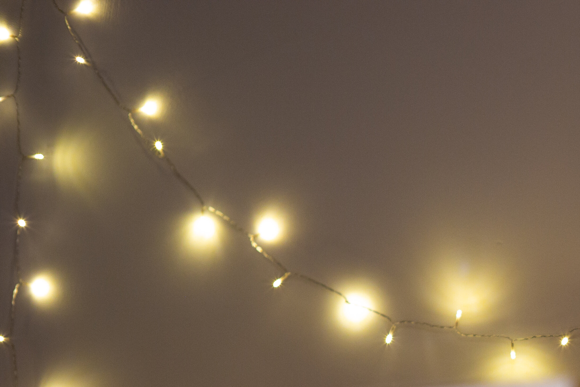


Wide open we can see external coma and severe sagittal astigmatism (SA) combining to create the dragonfly shapes towards the corner where the points of light should be. LaCA is also heavily fringing those “wings” with blue and the outward margins of the highlights with yellow/orange. Stopping down to F2 improves the image dramatically, bringing the SA almost completely under control in most of the frame and reducing the comatic aberration to insignificant levels. At F2.8 both chromatic and monochromatic aberrations are really well controlled and some beautiful sunstars are blossoming from the highlights. Unfortunately the sharpness is quite low across most of the frame. Sharpness and sunstars are improving from F5.6 and at F8 the image is of good quality.
Chromatic aberrations
Lateral and longitudinal chromatic aberrations (LaCA and LoCA) are the main types of aberration caused by diffraction of light through glass, much like the prism used by Newton (or the famous Pink Floyd album cover!). Light splits in a rainbow colour and, in an optical device like a camera lens, it becomes really difficult to focus the different colours back in the same point on the sensor. In the case of LaCA the main colours (green, blue and red) will be focused on a different point, while LoCA will cause the colours to be focused on different planes.
A typical LoCA that we have already encountered is spherochromatism, seen in the focus shift tests and noticeable in the out of focus areas as green fringing behind the plane of focus, magenta in front. In the plane of focus it will be visible as green, magenta, blue or red fringing on all sides of high contrast transitions (the battery detail at MFD wide open, if you remember). Another LoCA type is purple fringing (PF), which appears over the dark details in high contrast transitions and can be fairly obtrusive (look at the Voigtlander Nokton 50mm 1.5 Aspherical VM review under chromatic aberration test). PF is caused by a secondary spectrum colour (purple) that is focused even closer than the primary ones. While an apochromatic design can attempt to focus the primary colours all in the same focal plane, PF is very hard to correct for but it can be mitigated. PF is often confused with digital purple fringing, a very different phenomenon: it’s a digital artefact caused by light and electronic signal spilling into neighbouring pixels from the overly saturated ones in the high contrast transitions. It normally happens around dark detail over blown highlights, like in the Voigtlander Nokton 50mm 1.2 Aspherical VM review.
While LoCA will be brought under control by stopping down the lens, LaCA can’t and it will be always present no matter the aperture. It can be generally seen as green-magenta or blue-yellow fringes around high contrast transitions and the same colour will be on the same side of the dark detail. It gets worse towards the outer image circle. A really well corrected lens design can bring LaCA to very low levels.
Now, the Zeiss C Sonnar T* 50mm 1.5 ZM is almost 90 years old in design, with just a bit of botox and lifting applied by modern designers. How will it behave?
Centre crops:
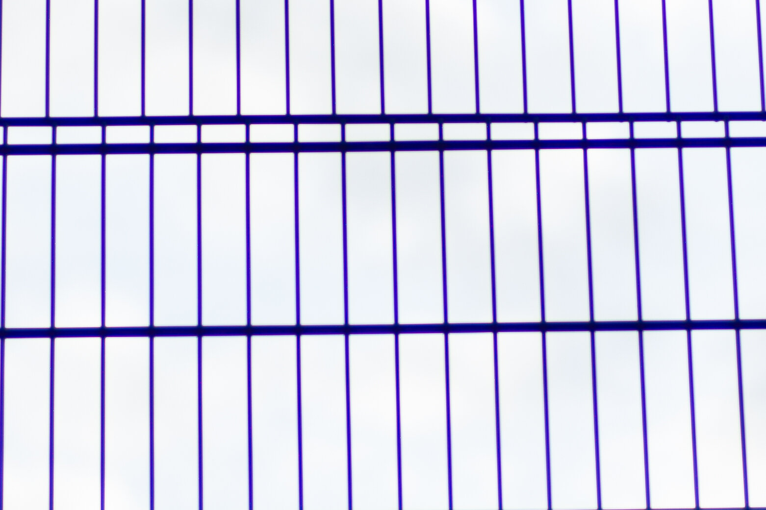
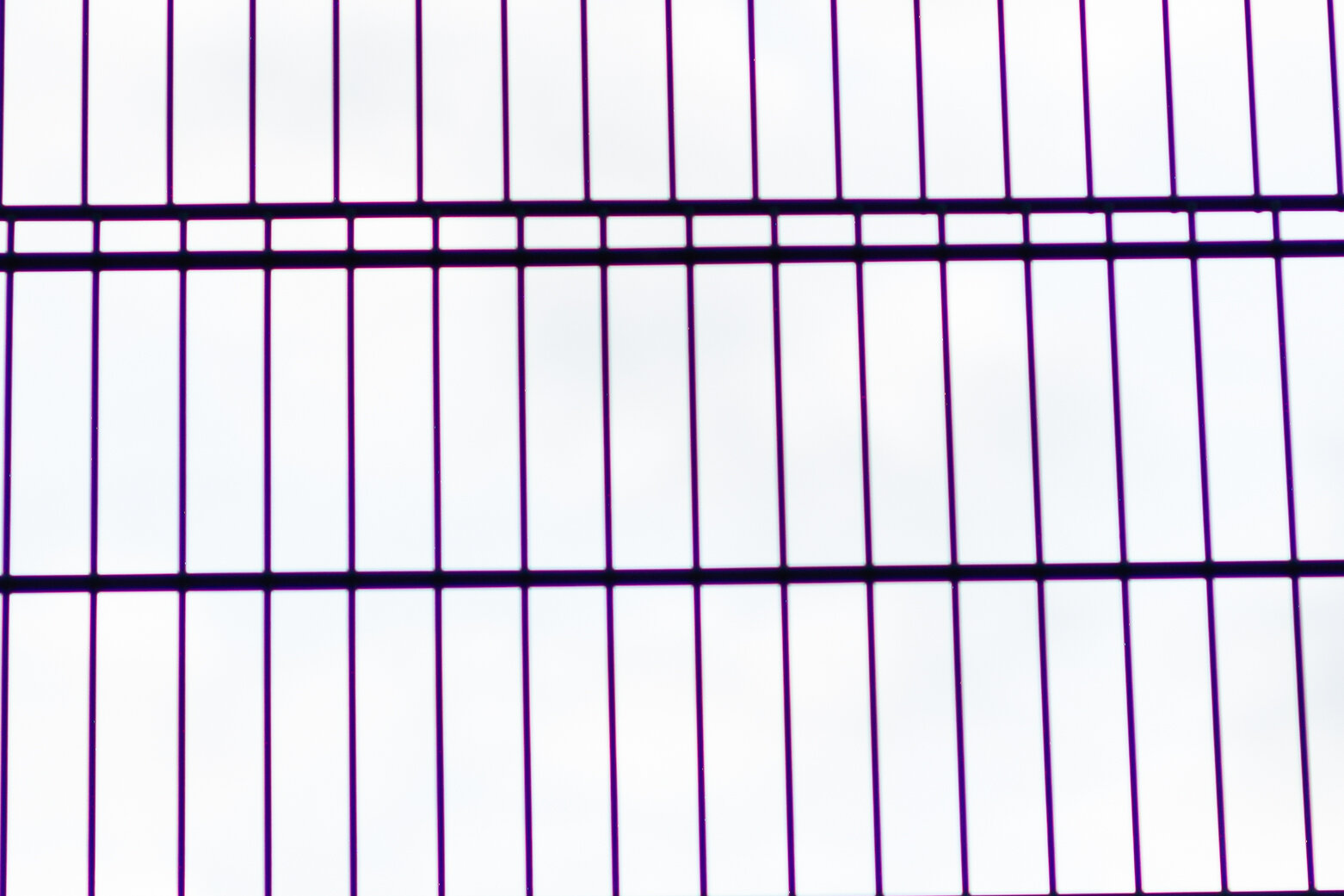
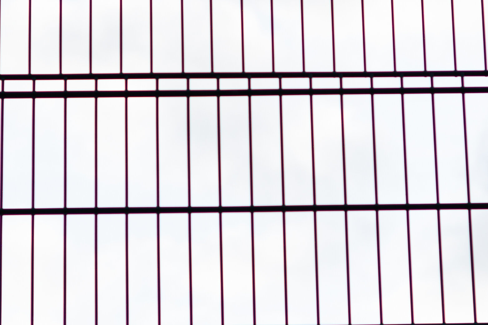
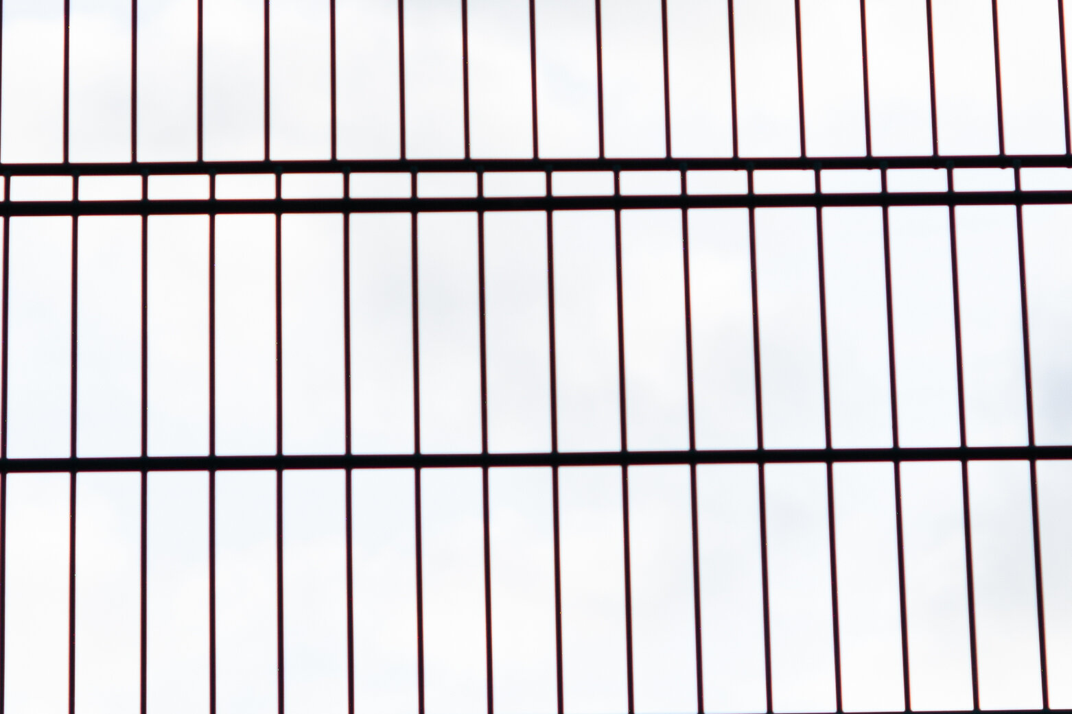
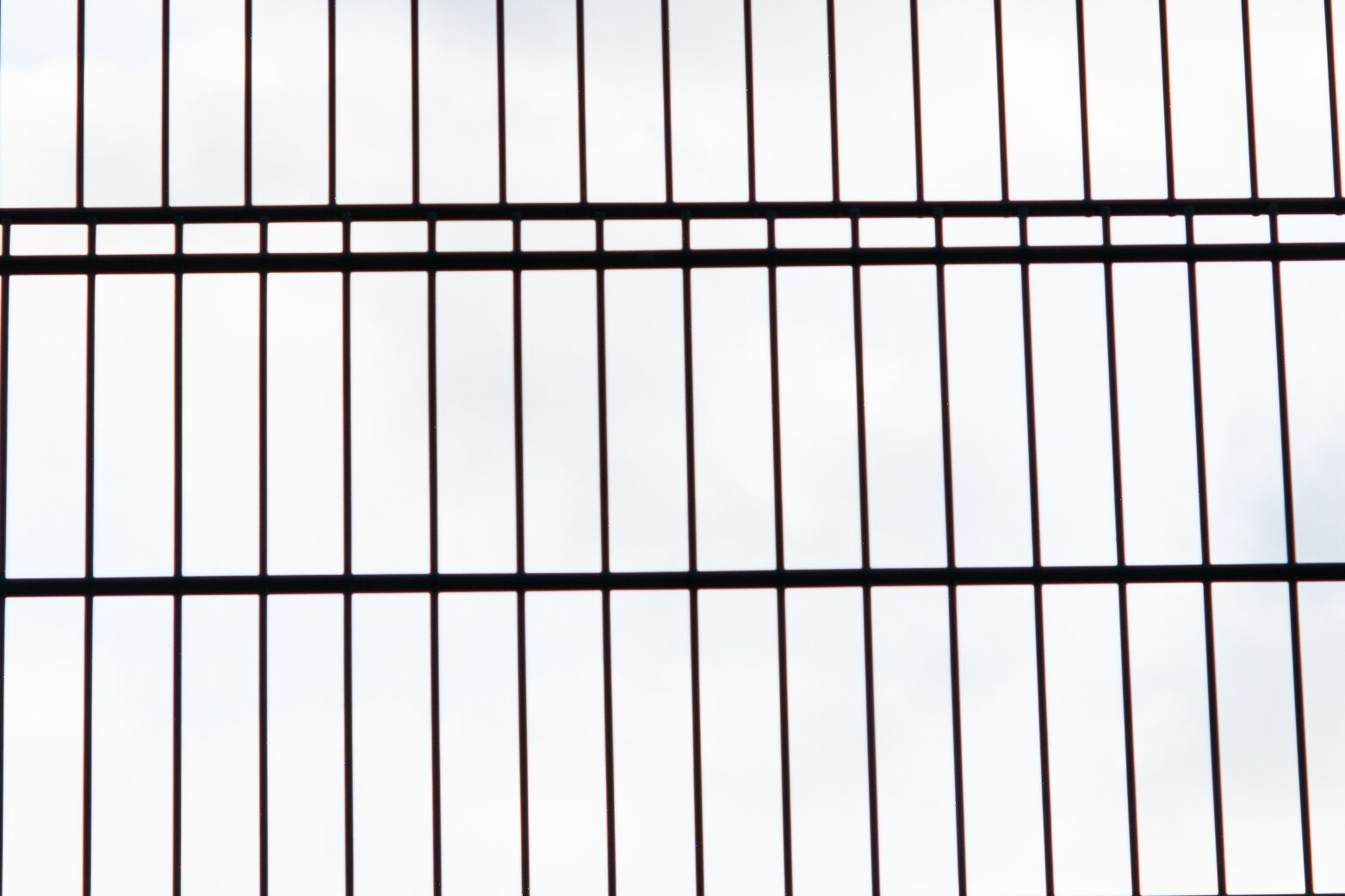
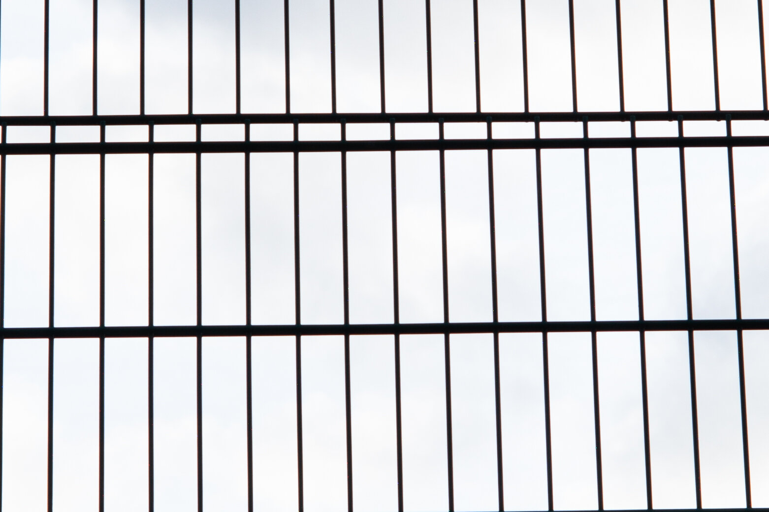
Wide open there is pervasive PF over all details, degrading completely the image. At F2 the PF is brought under control enough to see that the silhouetted fence should be black, but now all dark detail is fringed in red, caused by LoCA. At F2.8 the PF seems to be gone, only the red fringing remains. At F5.6 and F8 the fence is quite well defined and the red fringing almost disappears, but just off centre we can see a generous amount of LaCA appearing with blue-red fringes (look on the right side of the crop).
Corner:
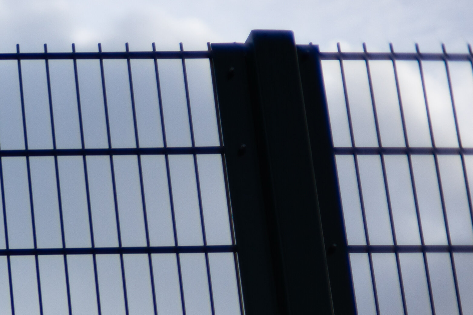
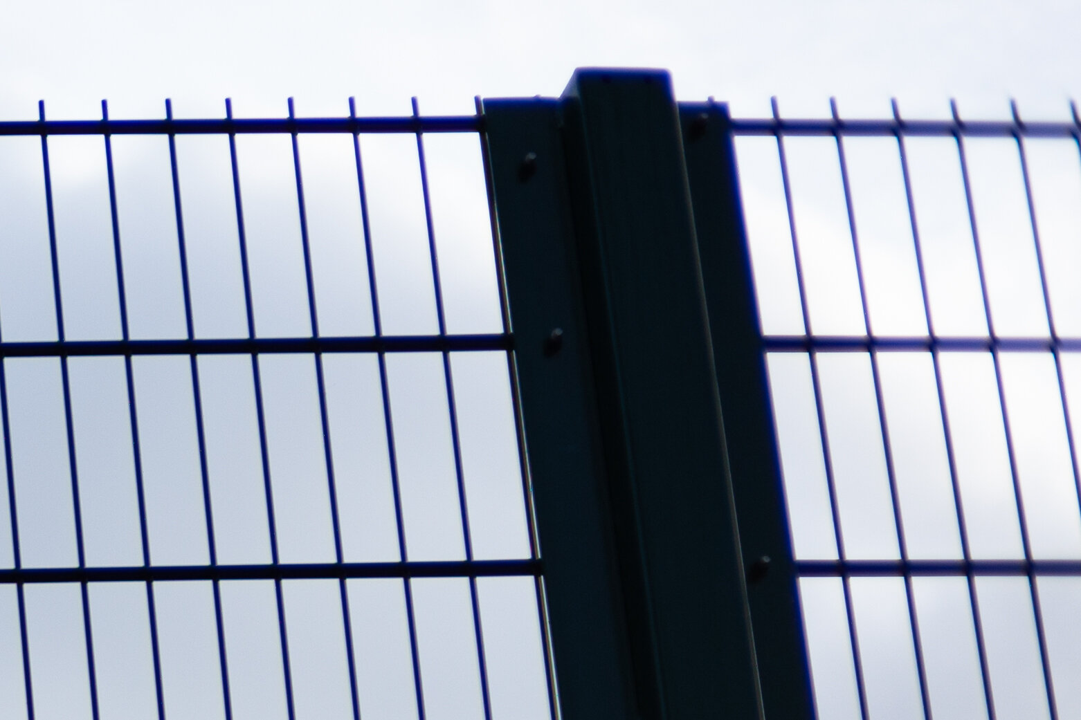
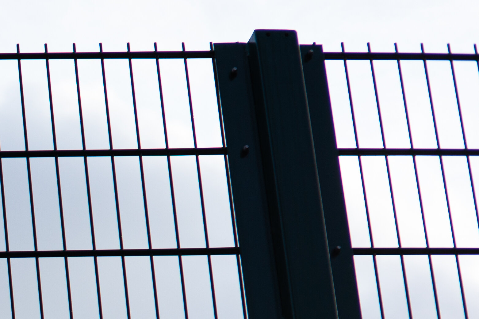
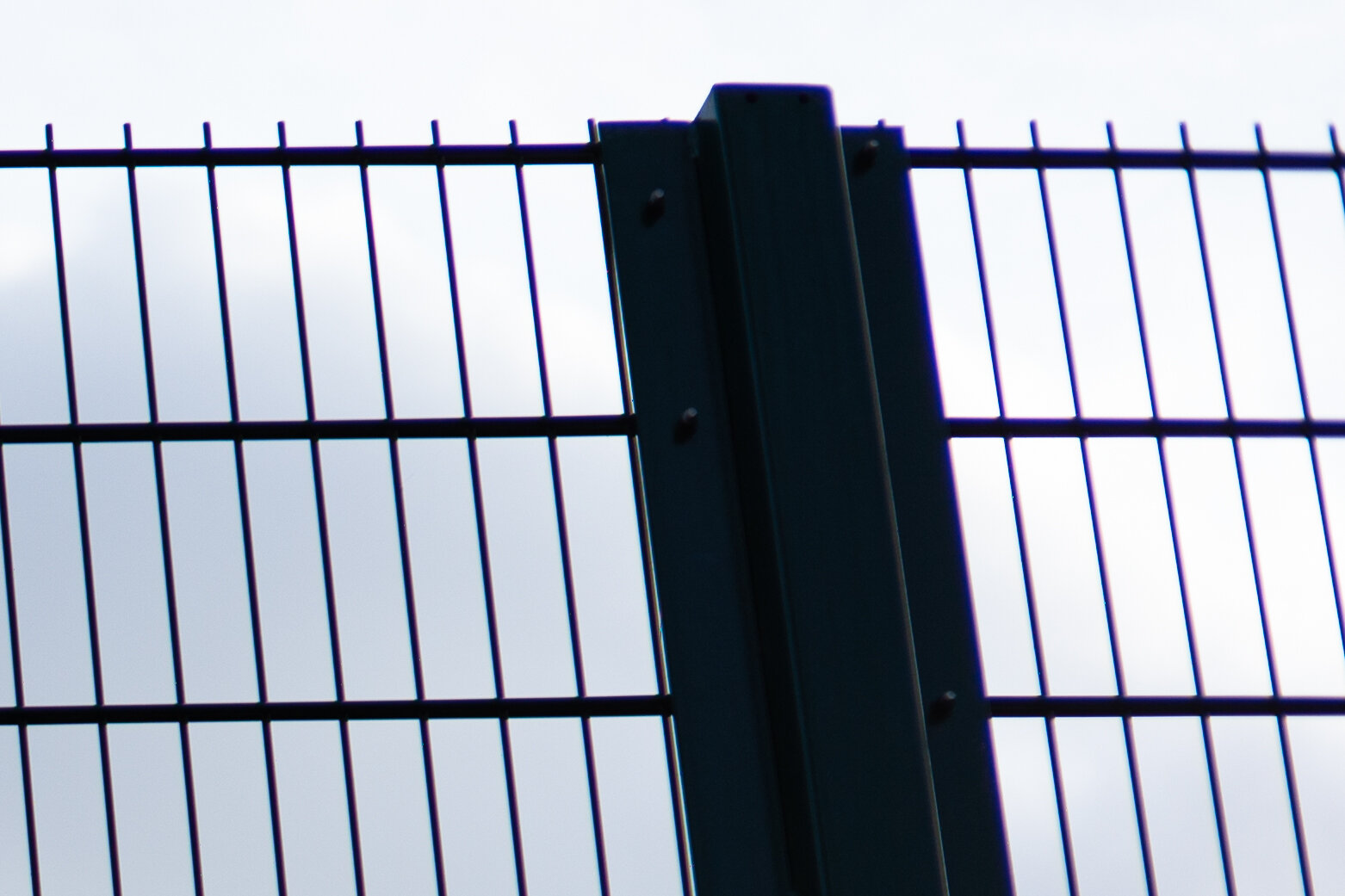
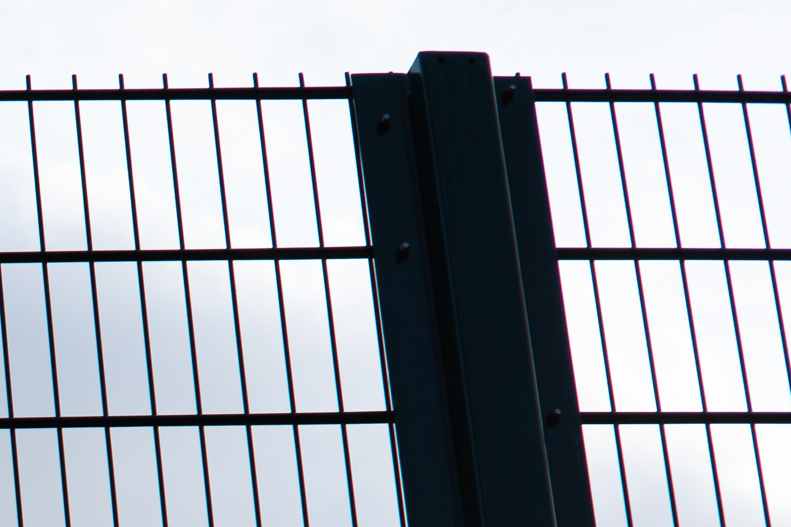
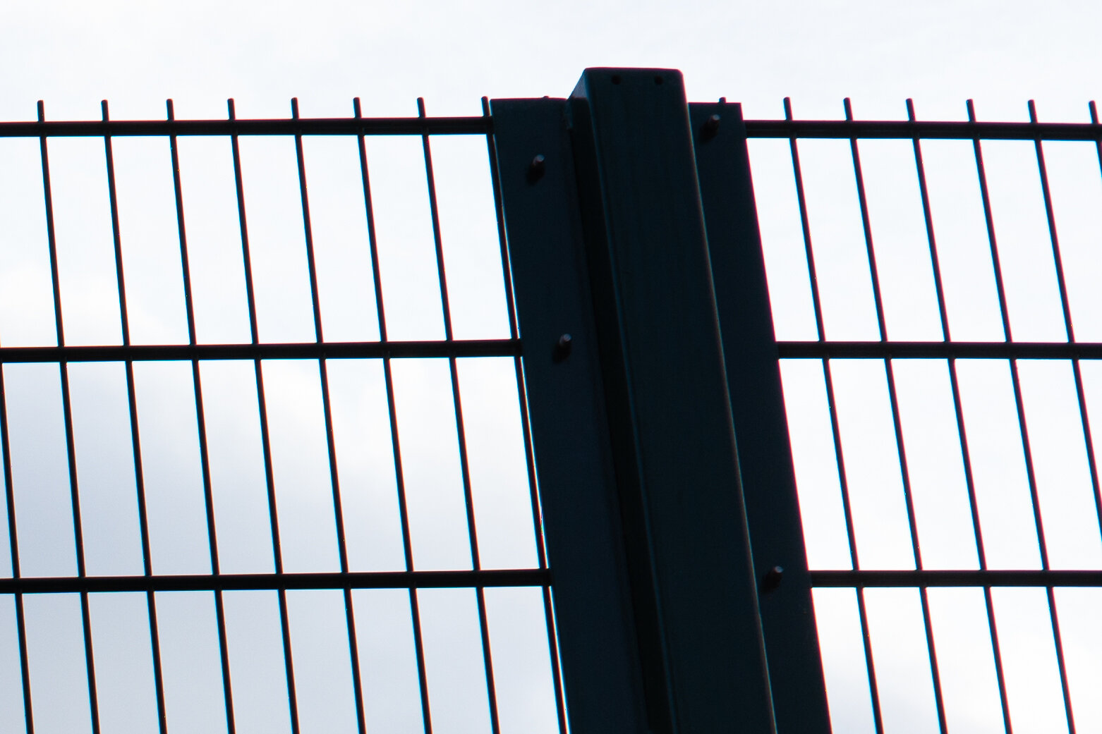
The corner shows what happens when you throw a healthy amount of LaCA, LoCA, PF, SA, spherical aberration, coma and possibly salt and pepper in the same pot - ehr, image: not a great look. Stopping down the image clears up quite a bit starting from the mid-frame, but still leaving a lot of aberrations in the corner. PF leaves the corner only at F5.6 and at F8 the sharpness is pretty good all the way into the last pixels. But: as soon as some detail appears (mid-frame area, from F2.8 onwards), we can detect a strong blue-red LaCA fringing that never leaves the image.
Flare handling
The series is taken wide open to get the worst case scenarios. The source of light is a LED powerful torch, shone straight into the lens, then obliquely around 45 degrees, then at almost 90 degrees. I repeat: these are worst case scenarios!
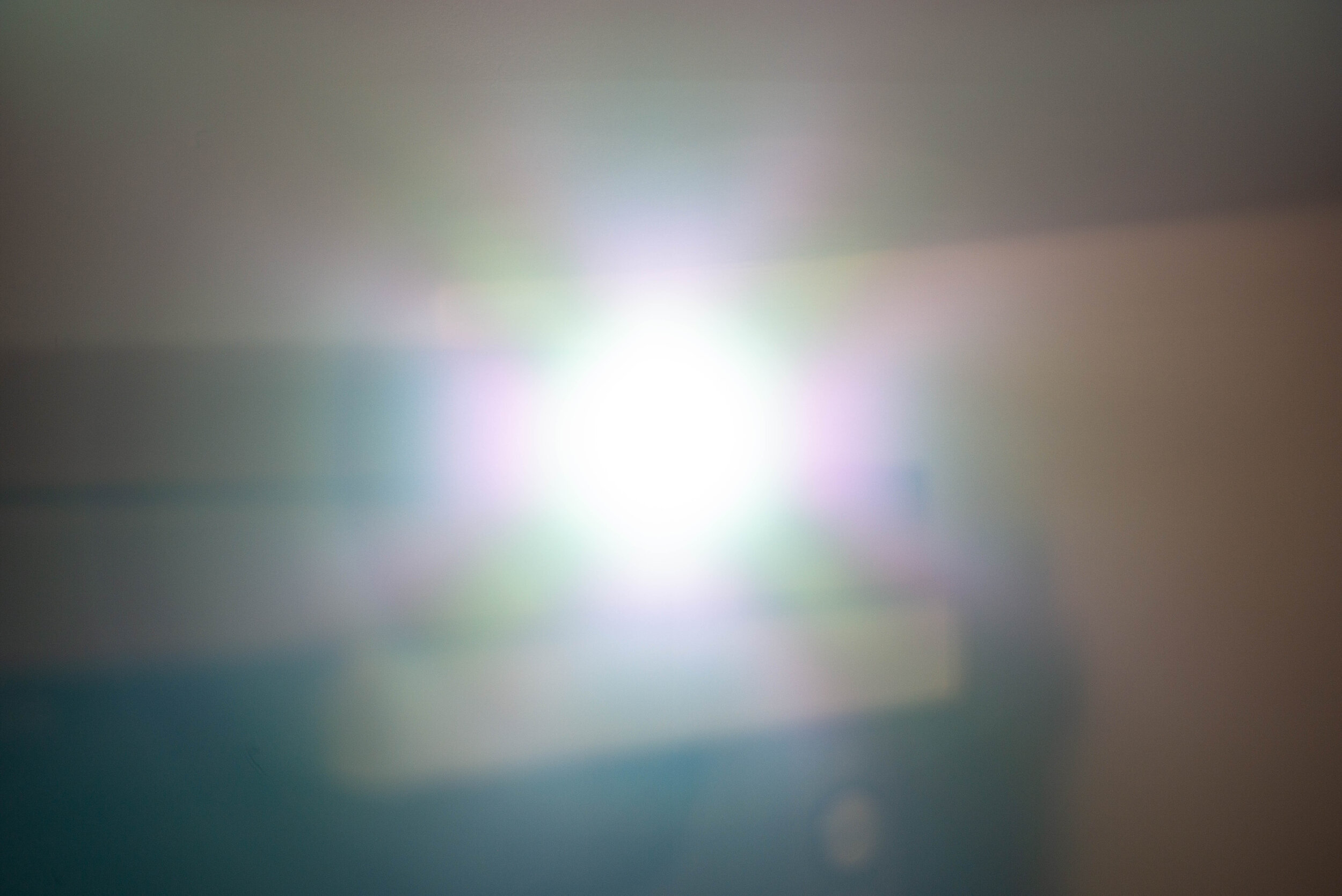

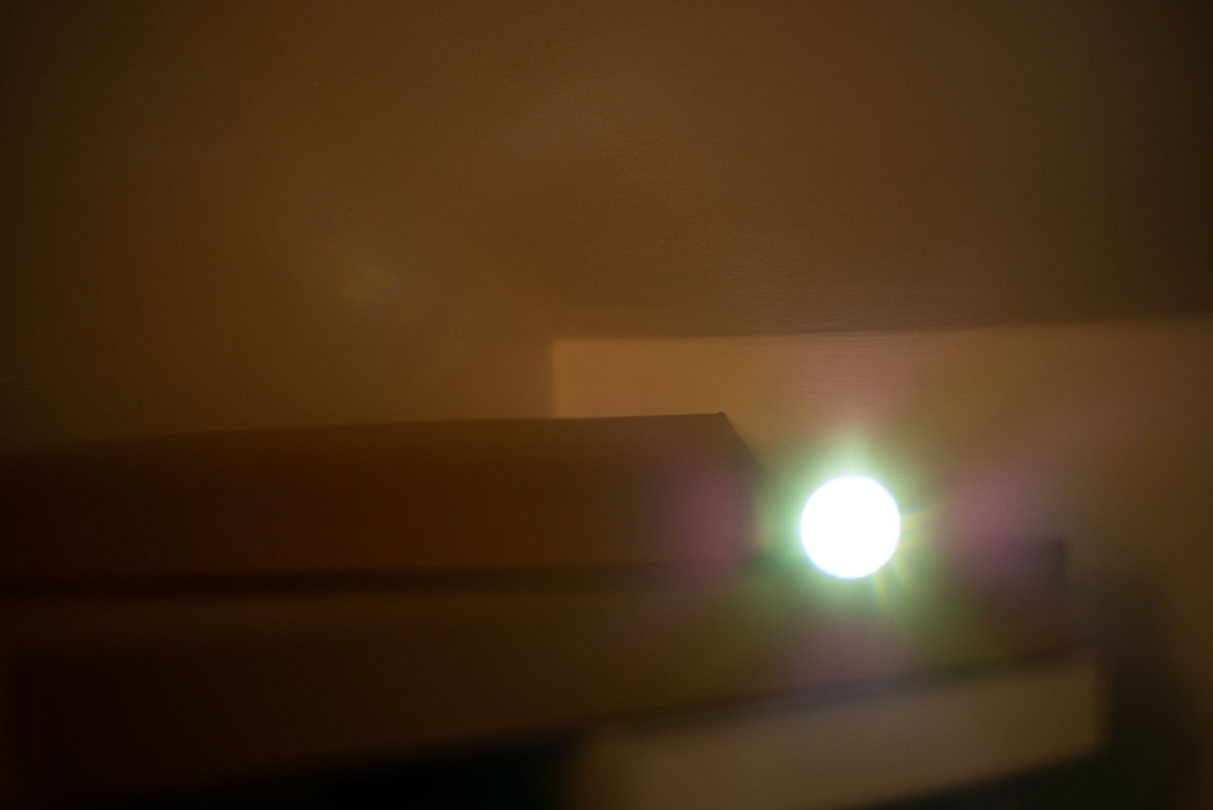
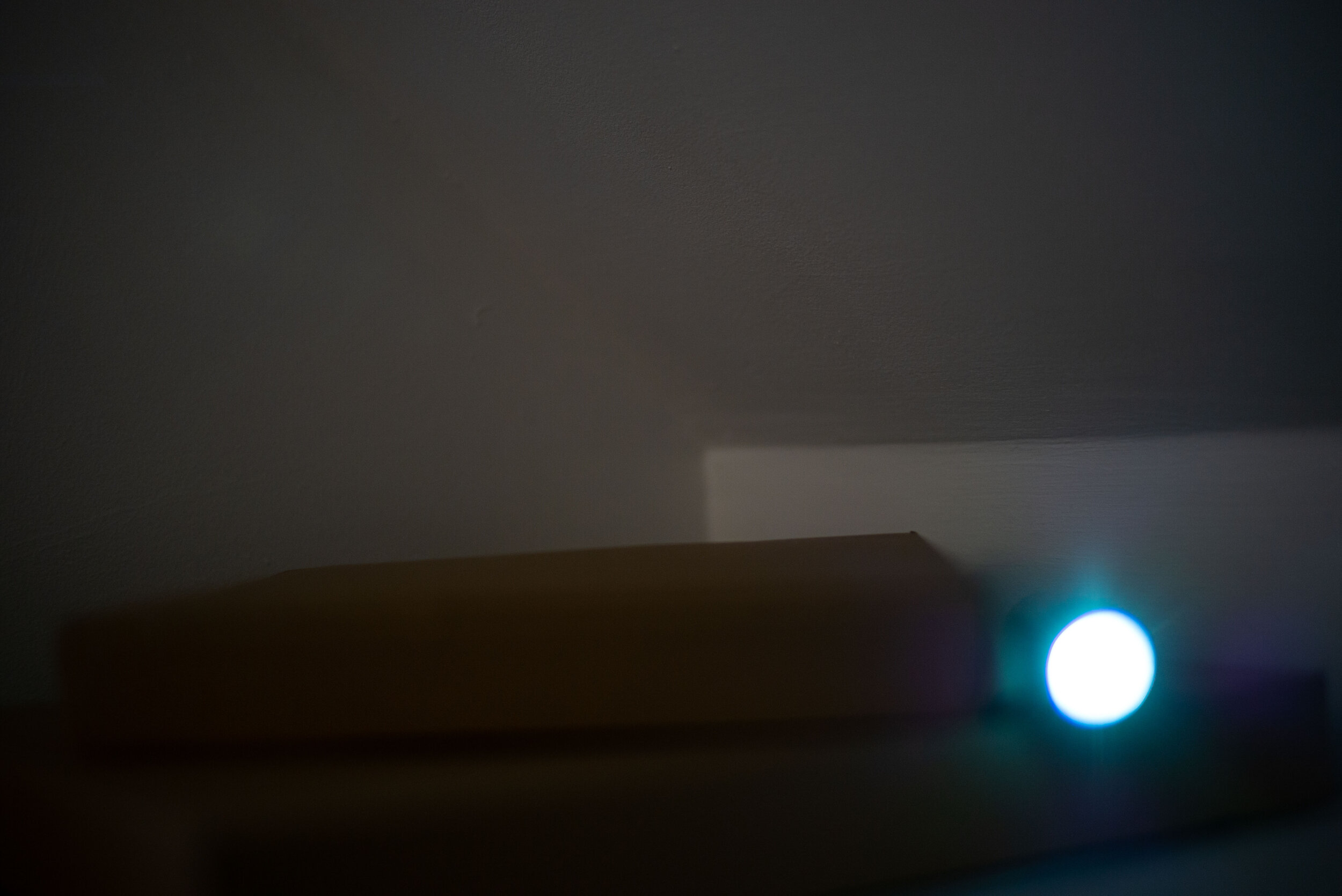
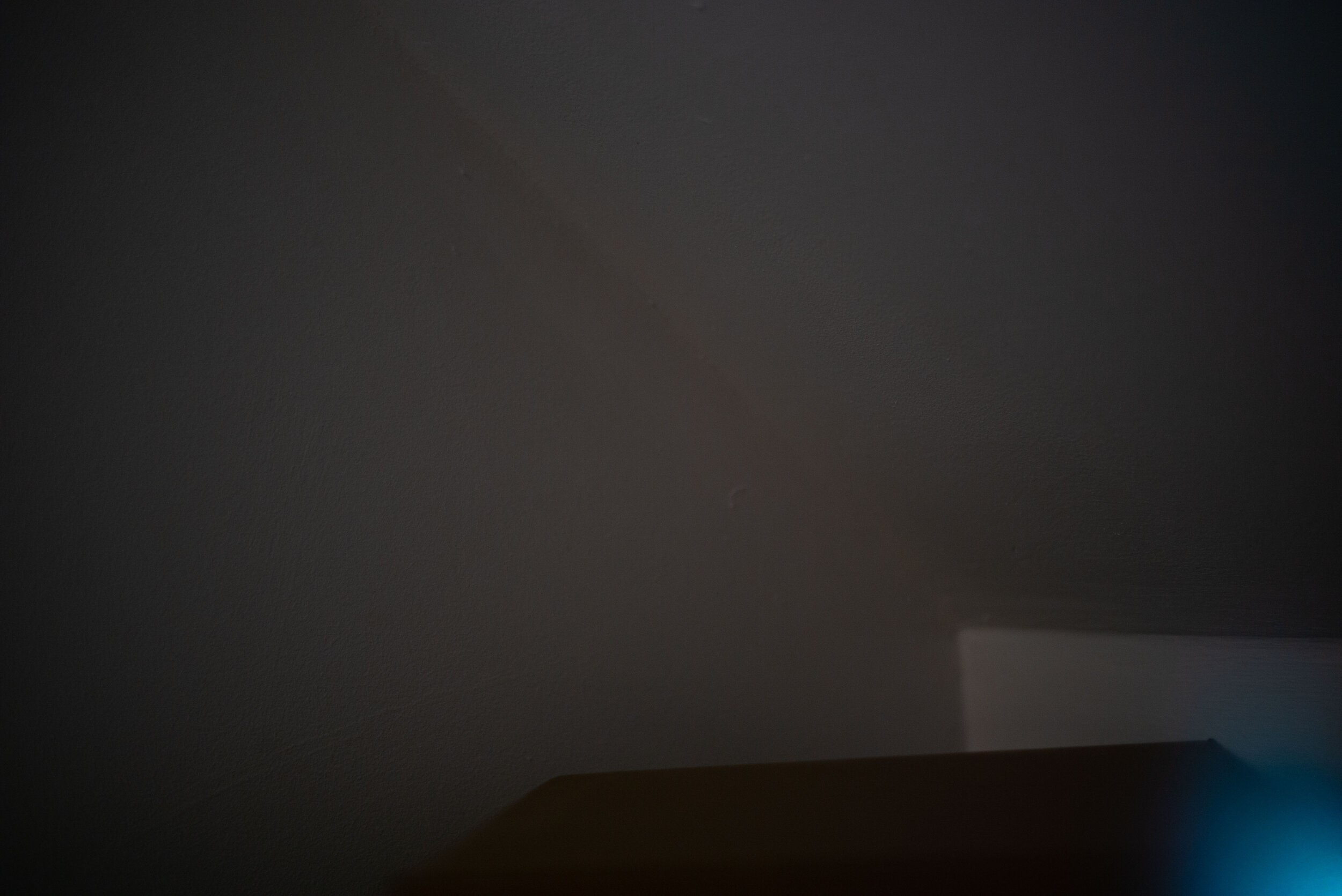
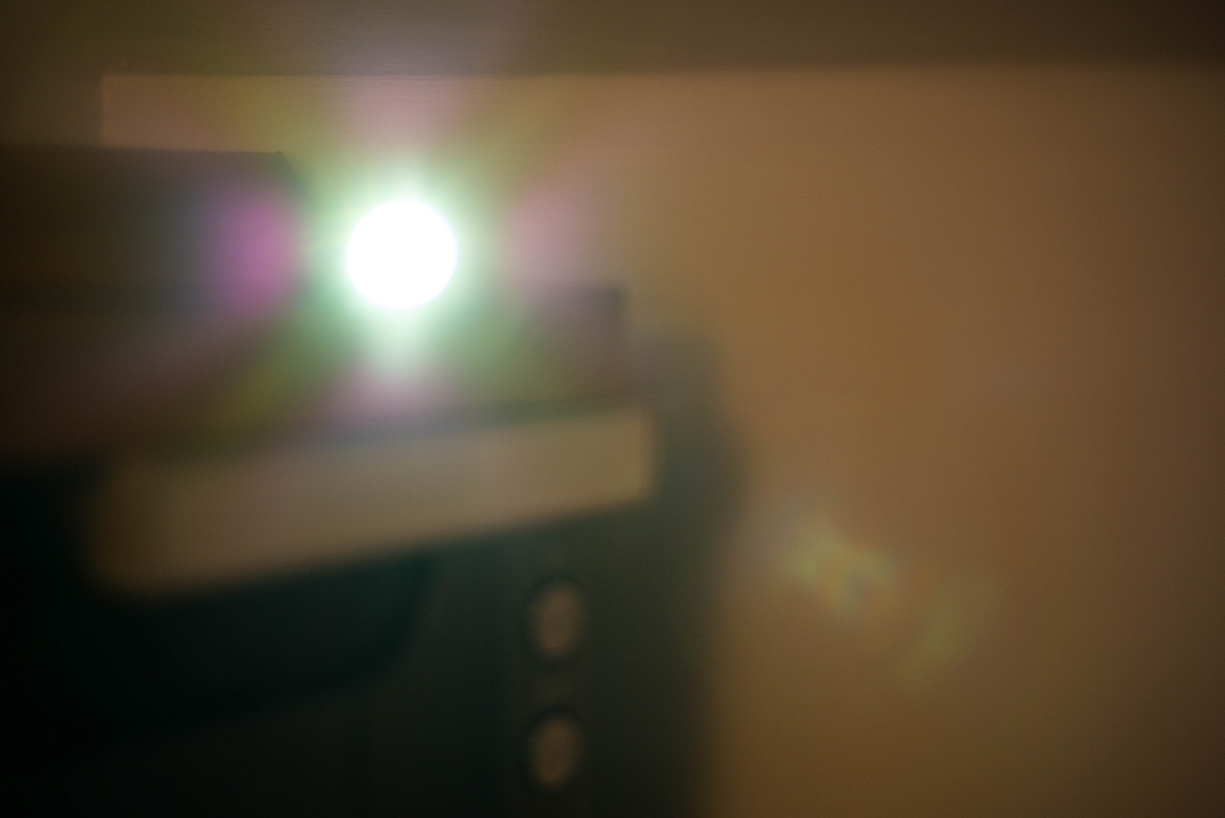
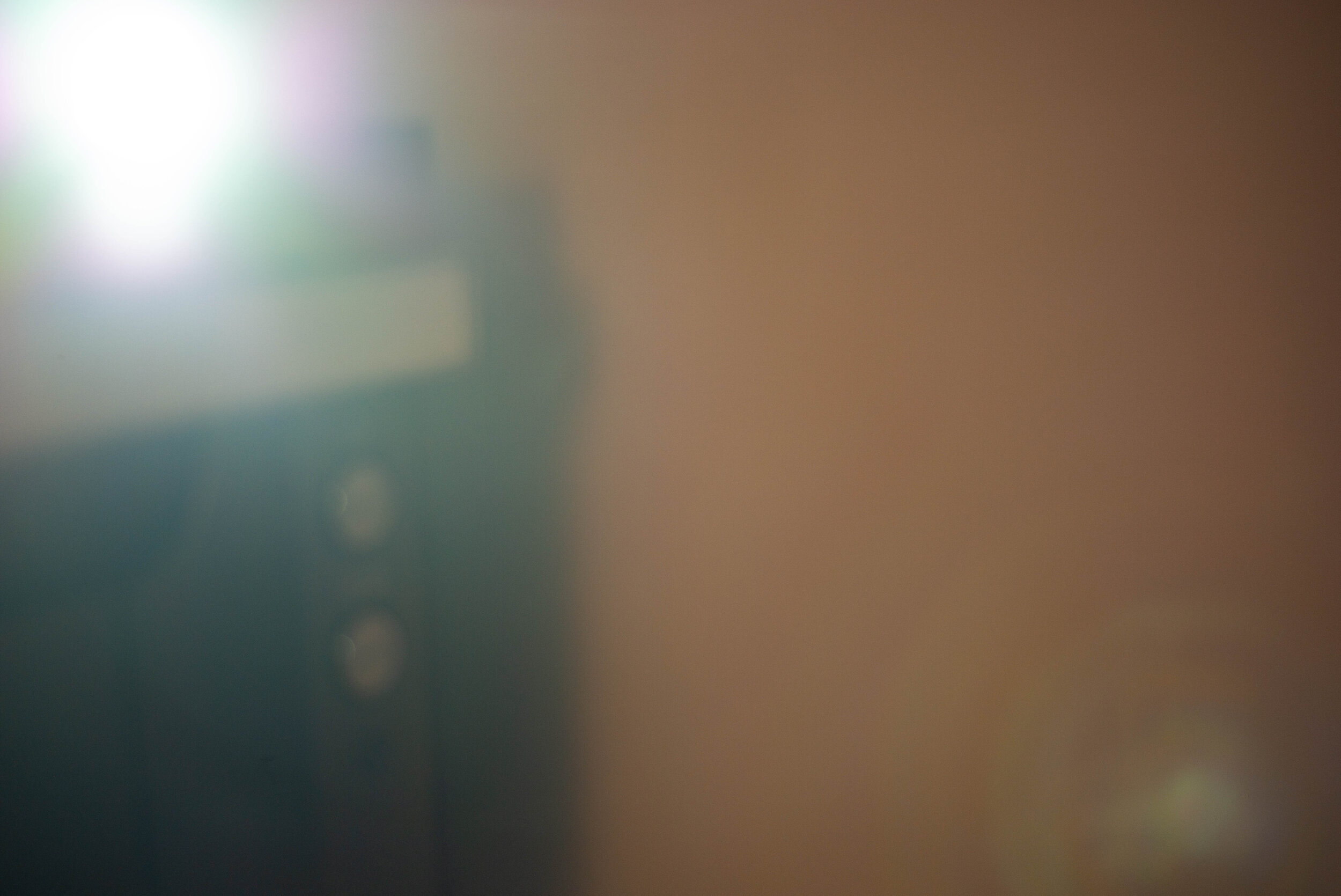
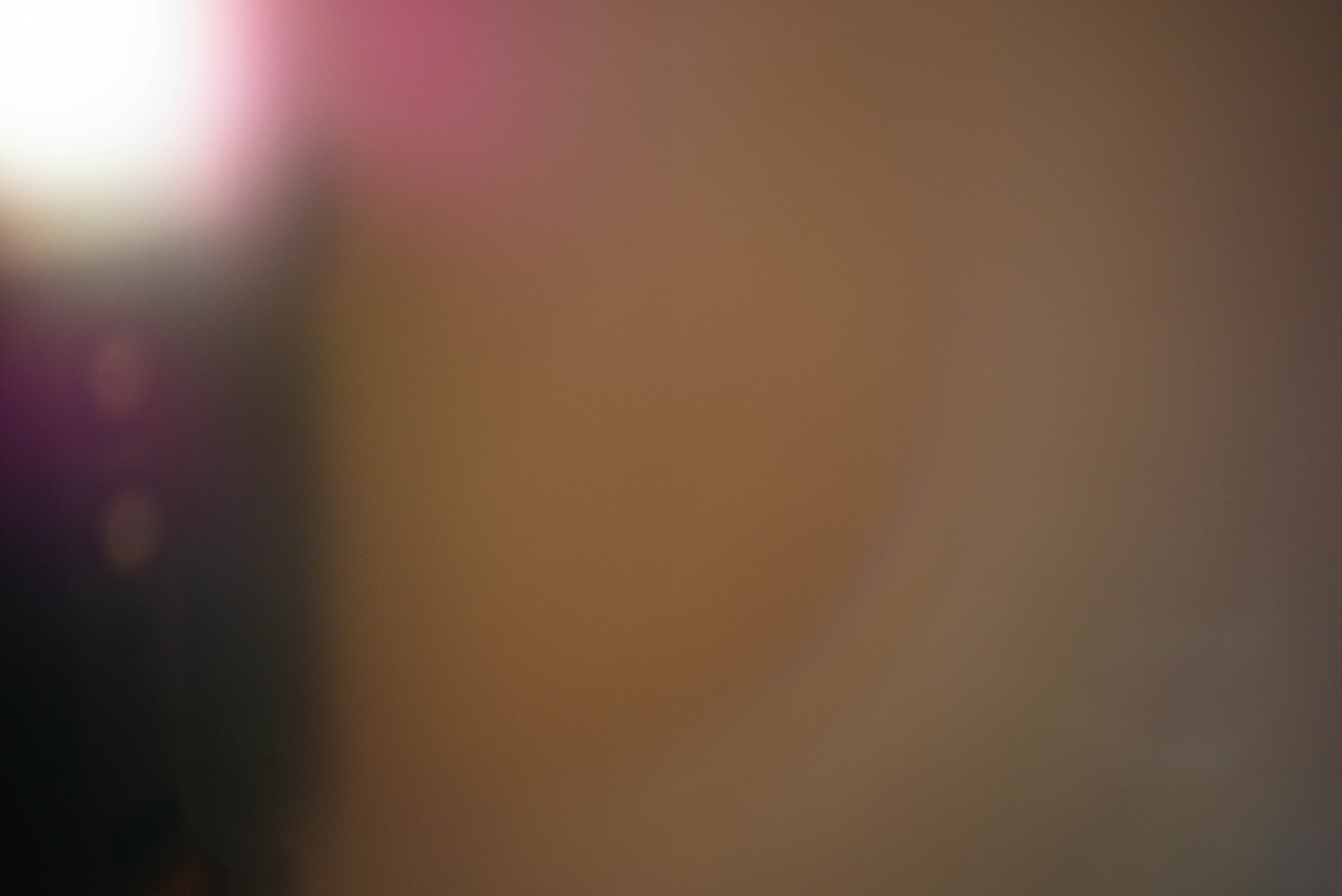
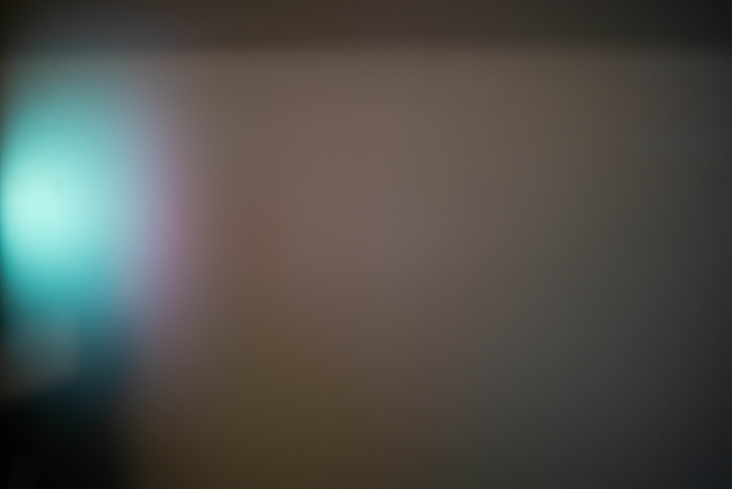
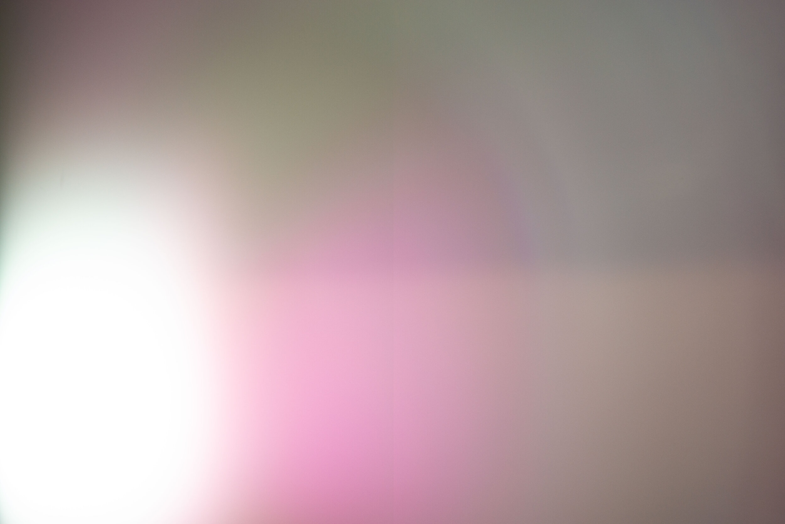
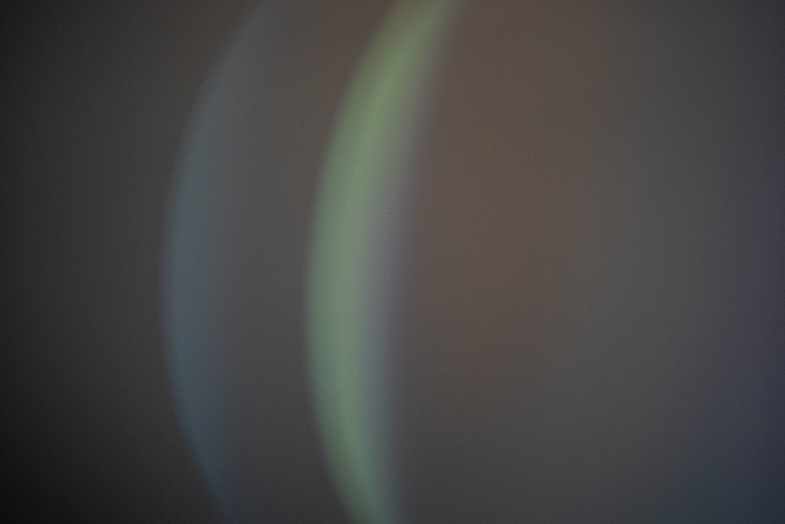
The flare resistance is exceptional for such an old design: apart from the goodness of the optical cell I think a lot of this performance is owed to the quality of the Zeiss T* lens coatings. The Zeiss C Sonnar T* 50mm 1.5 ZM mostly suffers from flare in two instances: straight on, light shining in the lens centre, and when the light source is hitting the lens elements obliquely in the outer image circle and from outside of the frame. This are weak points for many lenses. Outside of edge strong light will commonly create some blooming in most lenses. Great performance overall for an almost 90 years old lady!
Vignetting, distortion and field curvature
Any fast prime lens will have a lot of vignetting wide open. Especially when their size is that small. But the C Sonnar is doing pretty well, with a moderate amount of vignetting at F1.5:
Stopping down to F2 the vignetting is already much lower and irrelevant by F2.8, although it never truly disappears. I consider this a very good performance.
The colour signature of the lens is slightly green-yellow but fairly neutral.
The distortion of the C Sonnar is extremely low:
Although the distortion is irrelevant for most practical purposes, there seems to be a moustache waviness to it, and the +1 correction seems to flatten it somewhat. I don’t think I would ever notice the distortion in real use.
Field curvature:
This field curvature image also gives us an idea about how much the C Sonnar loses definition in the outer half of the frame: look at how the sharpness field is fairly dense and compact in the centre and then disperses on the lateral thirds of the image. The field curvature looks like it might be slightly wavy, positive in the centre and negative in the outer area.
At last, let’s talk about the bokeh!
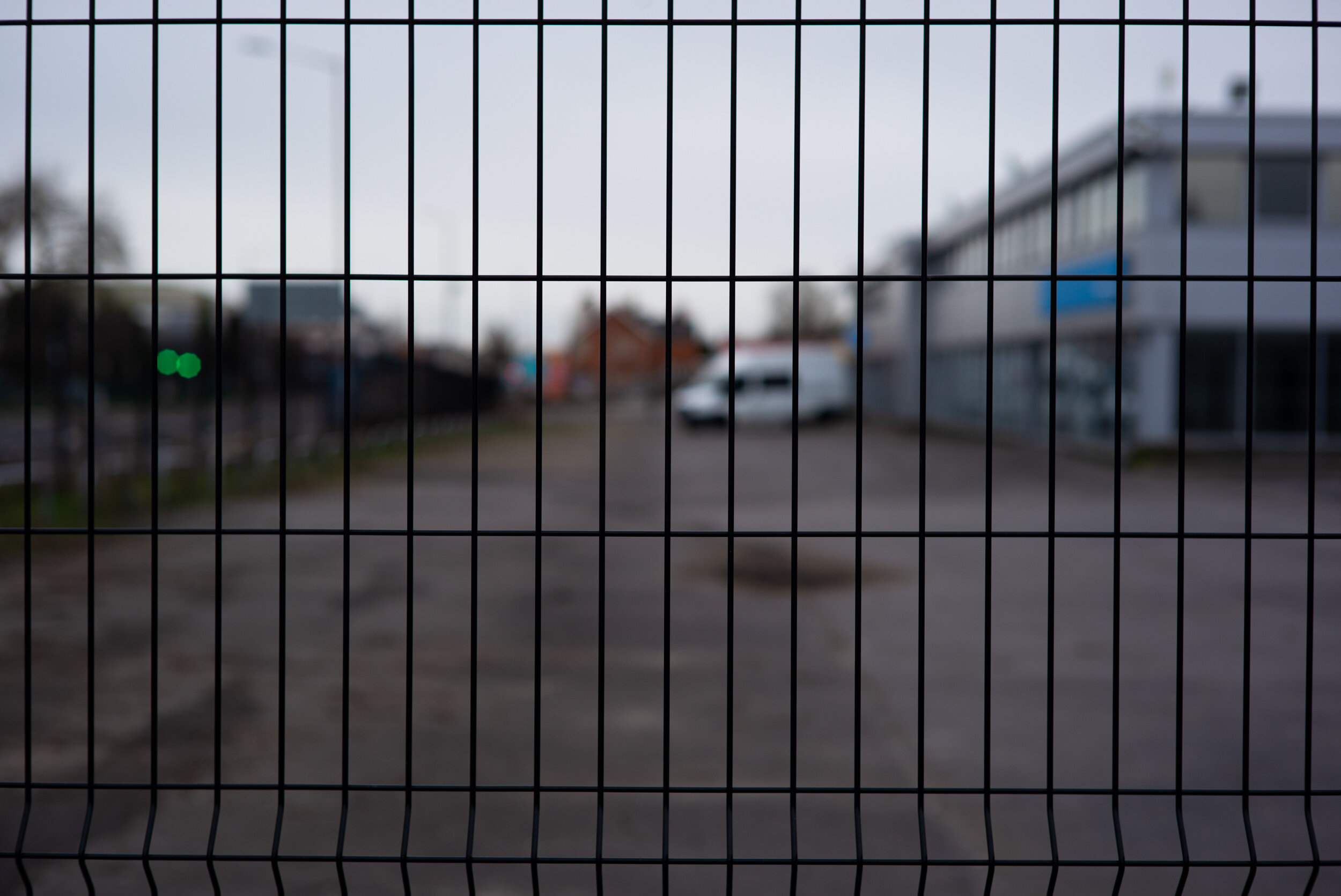
Of course we could not forget to analyse the bokeh rendition of the C Sonnar. It seems to be one of the qualities that give it its cult status. Here are the images we will be looking at: click on the grid to open a larger version in Flickr.
The closer focus test shots will demonstrate the quality of the bokeh balls on the out of focus highlights (OOFH), the amount of cat’s eye bokeh (CEB) caused by mechanical vignetting. Chromatic aberrations and spherochromatism in particular will be visible if present.
Close focus:




The Sonnar 1.5 shows a very strong yellow and blue outlining in the medium brightness OOFH, consistent with its LaCA, just yellow on the brightest ones. Spherochromatism appears on the inwards edge of the OOFH from mid-frame. CEB is not pronounced, becoming a cylindrical shape in the corner. At F2 there is a noticeable improvement on the outlining issue. A faint circular saw blade shape is appearing due to the inwardly curved aperture blades. The outlining has disappeared at F2.8 and from F5.6 the OOFH are starting to produce a sunburst.
Focus at 3m:


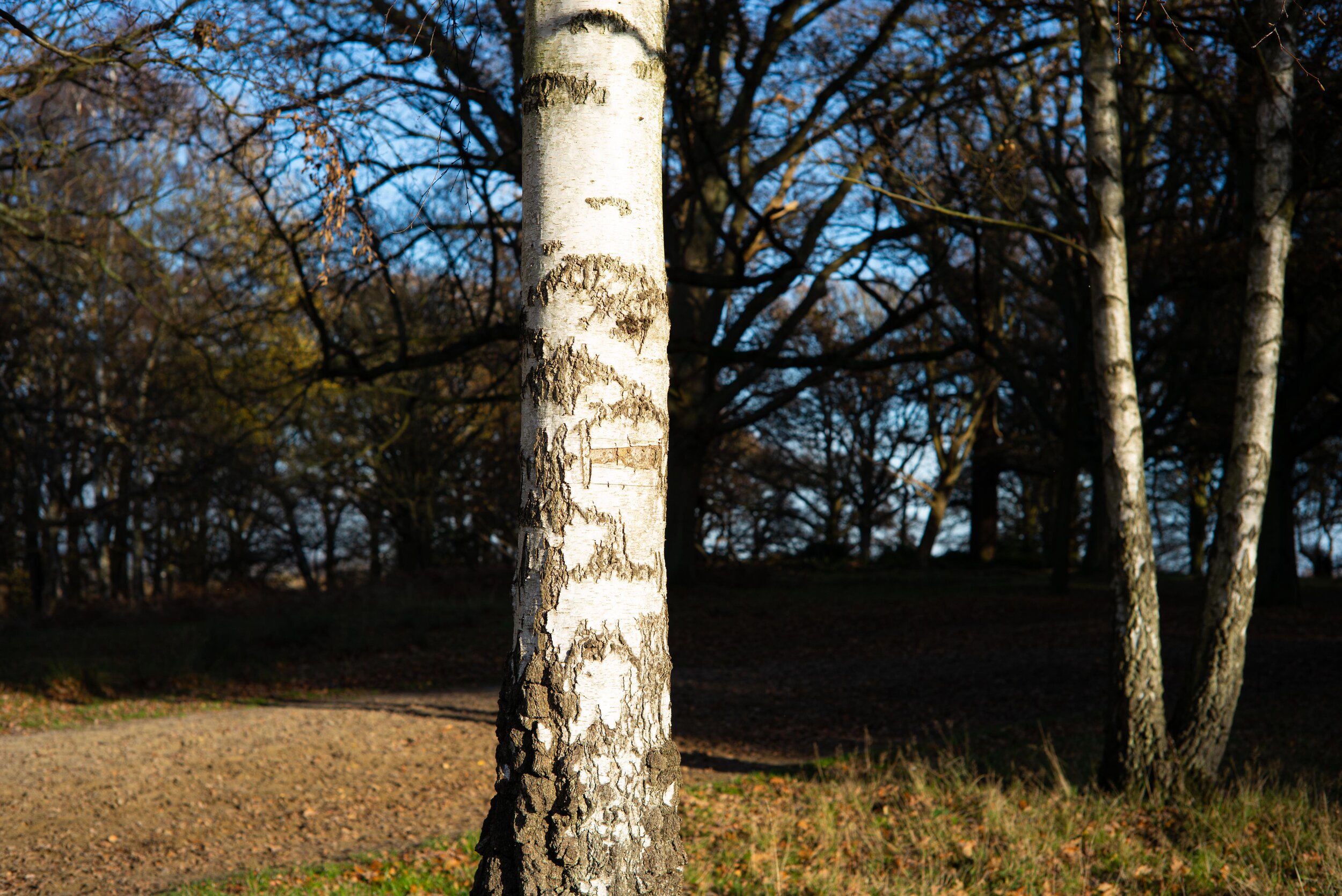
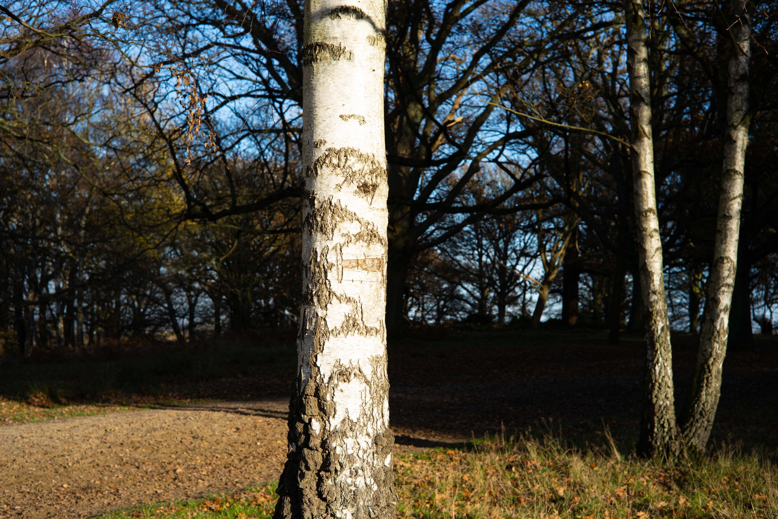
Overall the wide open bokeh is fairly smooth and quite pleasant, notwithstanding a slight outlining lending a hint of wiriness to some areas. The spherochromatism is there but is not degrading the image unless you pixel-peep. At F2 it is just smooth and it remains so when stopping down. There is a little higher sharpness in the corners.
Focus at 6m:
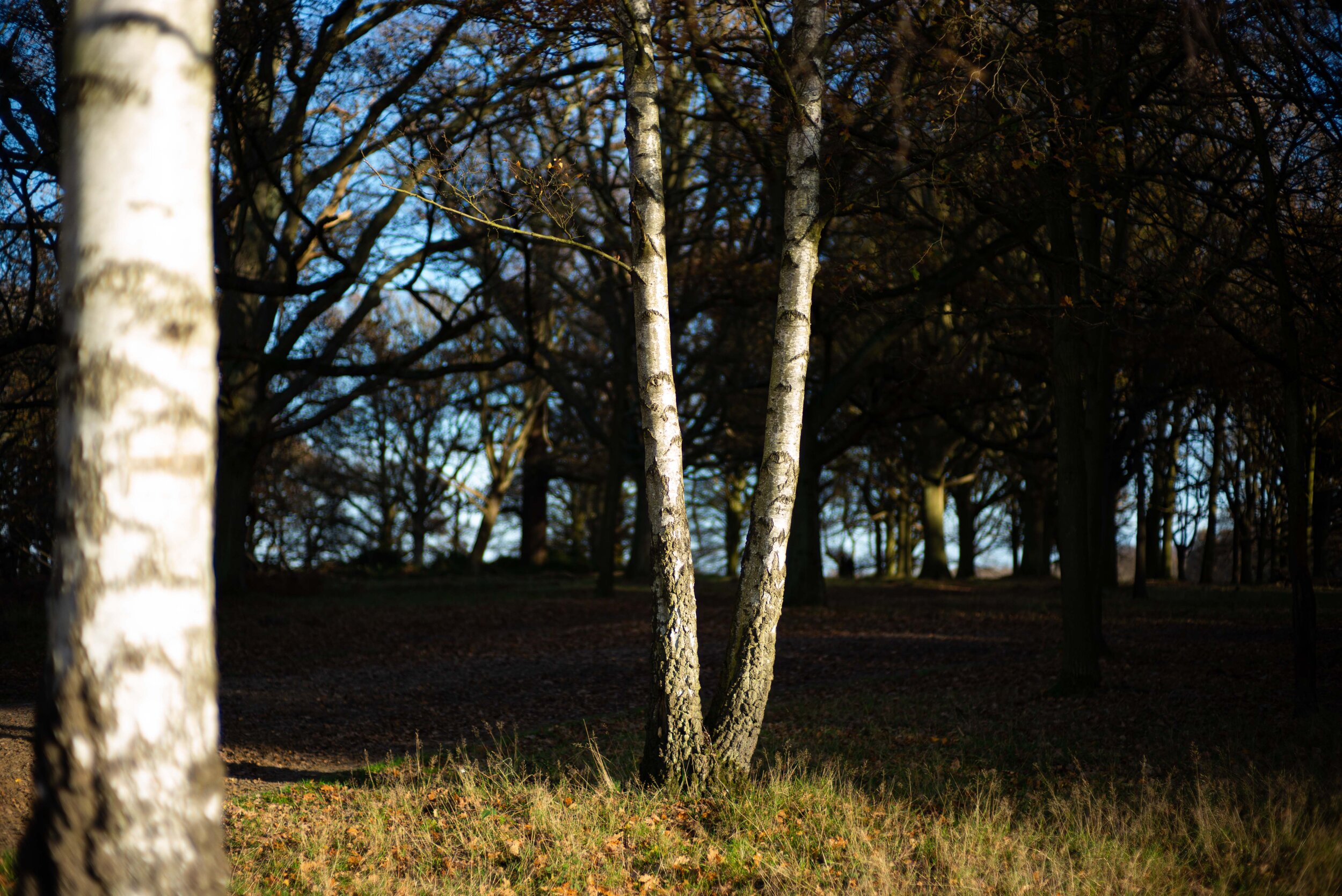
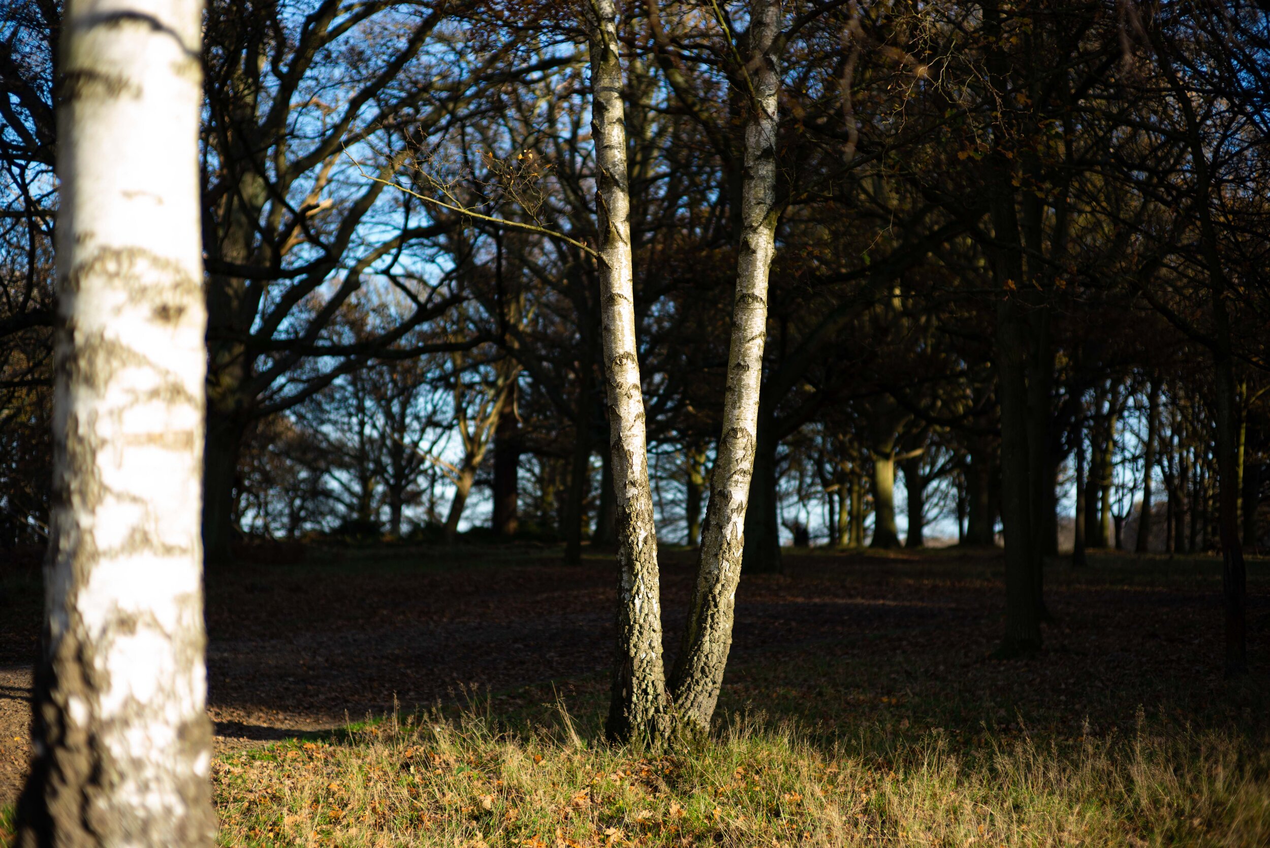
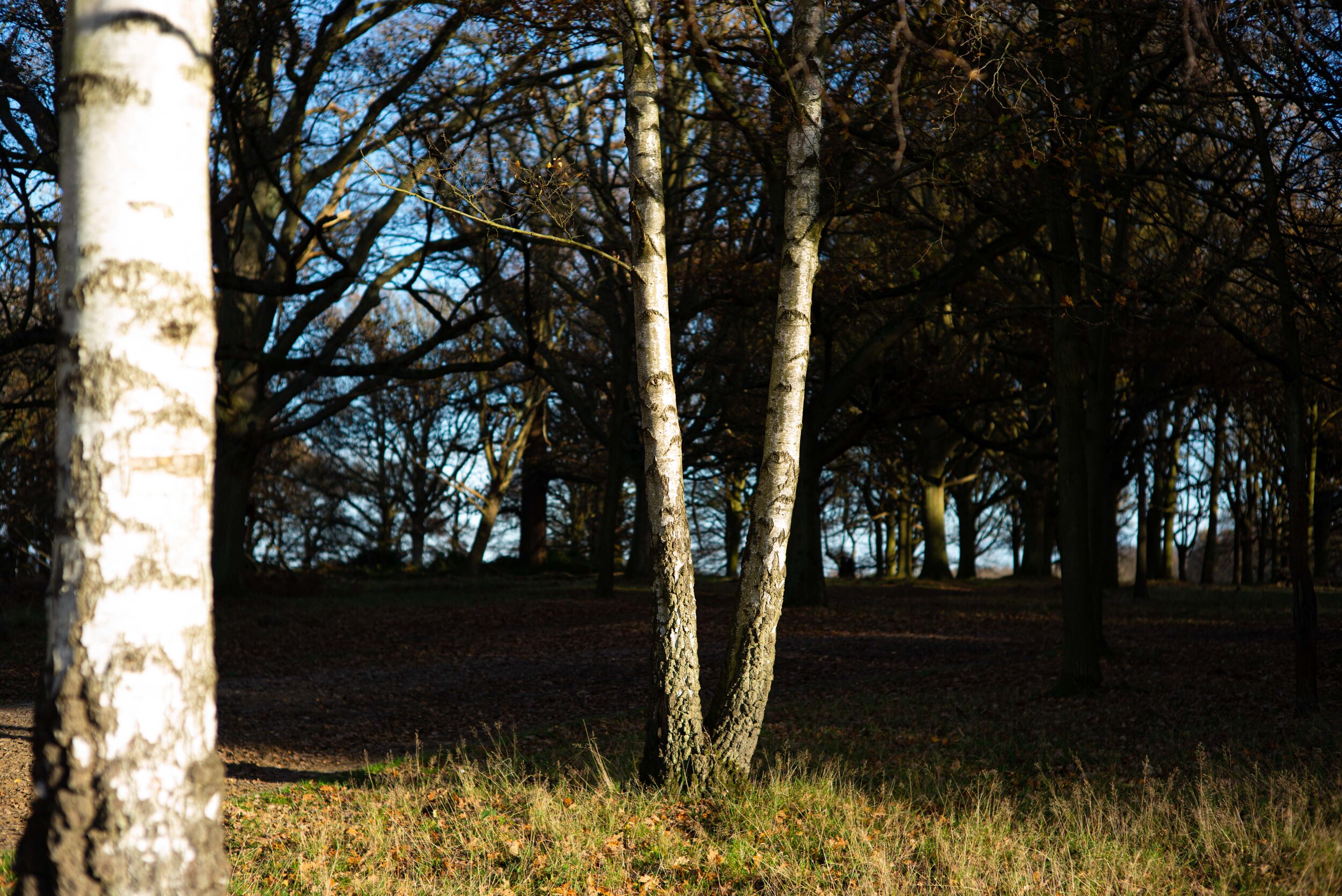
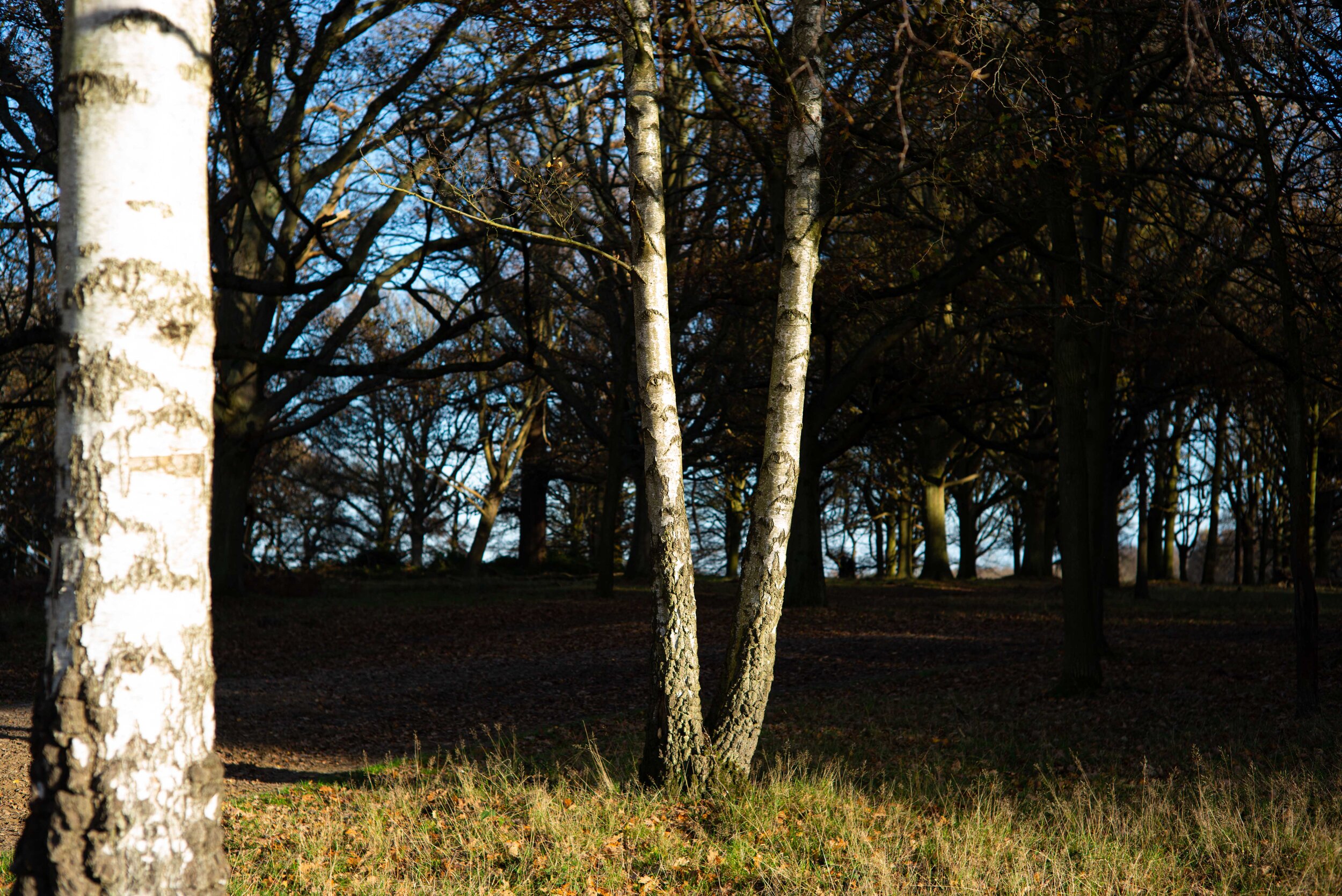

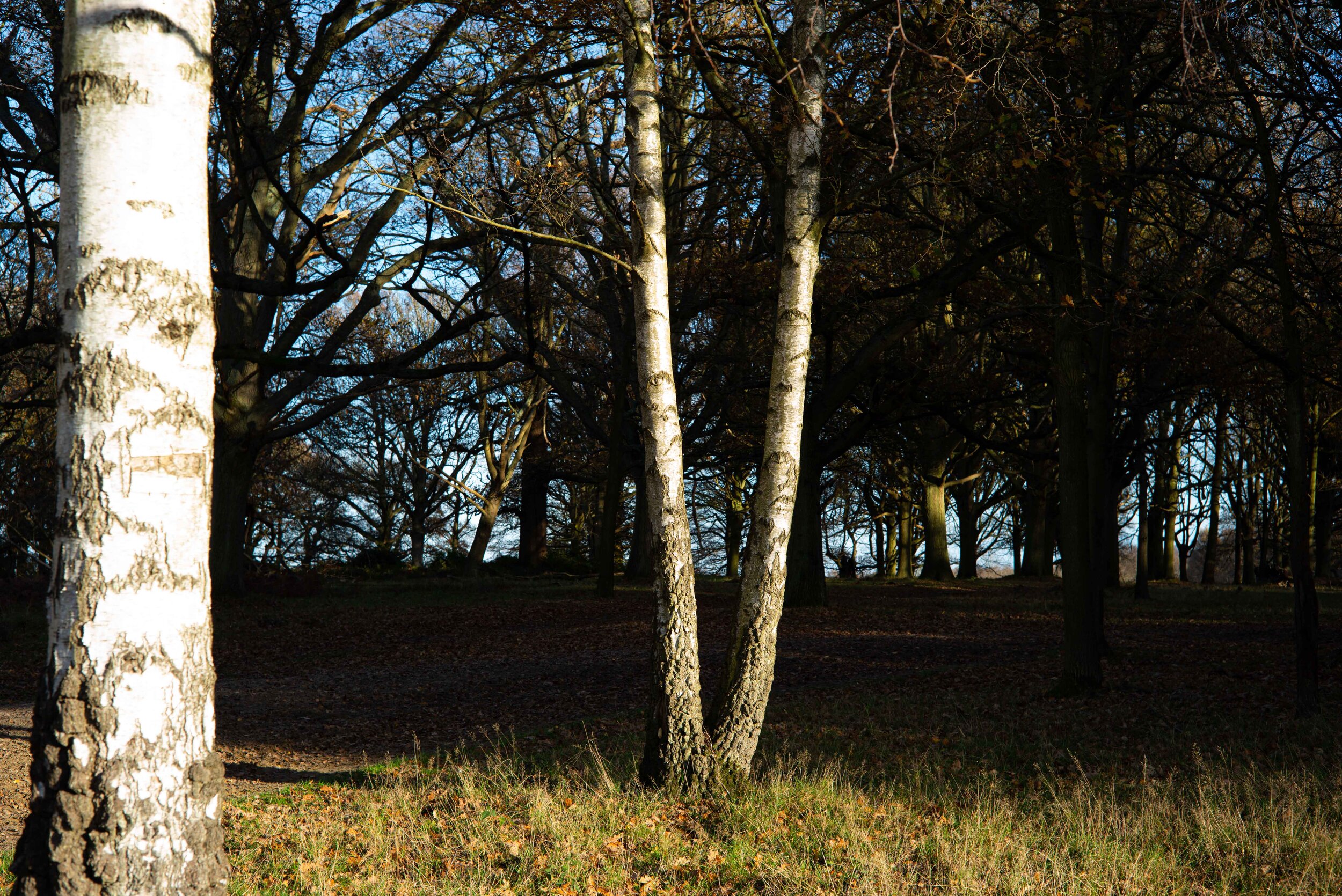
The OOFH are showing some outlining at this distance and some purple colouring inside caused by the spherochromatism, that is also tinging the branches against the sky with green. This is the same as the focus at 3m but more noticeable here. I need to point out that the same is also happening to every single lens in the 50mm lens comparison here. The corners seem to be sharper than the centre, probably due to the mechanical vignetting and possibly some negative field curvature at further distance. The bokeh is a bit less smooth at this distance.
The bokeh from this mythical Sonnar design is…nice. Nothing exceptional there in my eyes. The only thing I find different and positively so is the shape of the OOFH towards the corners, that become cylindrical instead of lenticular like the usual CEB, lending the image a more uniform appearance in the defocused background outside of the central portion of the image.
What about portraits?
If you speak to any fan of this lens they will describe its magical qualities, but mostly they will mention the bokeh and how this lens sprinkles fairy dust on any portrait. Is that true? I really hope I won’t have any dust on my sensor after this test! Fairy or not, it can be a bugger to completely remove!
I set up a studio-like kind of portrait with a light 45 degrees angle to the right and above the subject, my beautiful wife Daniela. There was a reflector on her left to lift the shadows. No rim light around the hair because I could not produce a decent one with my extremely limited lighting equipment.




I didn’t hear any magical spell or pixie sounds while releasing the shutter. I hope the Sonnar design is alive in the lens! Let’s have a look:
Wide open it’s not bleeding edge sharp but there is plenty of detail. Aficionados of the Sonnar talk about the lower sharpness as an asset because it can make the skin blemishes and wrinkles softer and less harsh. I don’t see that in the portrait, the recorded detail is still high. There is a gentle transition to the out of focus region, visible on Daniela’s right eye, eyebrow and cheek (on our left). At F2 the detail is already very sharp, and it peaks at F2.8. It makes no sense to go beyond F4, the quality of the image is already stunning.
Keep in mind that each shot has been carefully focused through the electronic viewfinder (EVF) and focus peaking. This level of accuracy for the focus point is impossible with the rangefinder at this distance unless you are wide open. Stop down and you are guessing where the plane of focus will fall, thanks to the spectacular levels of focus shift.
Conclusions
So, what do we think of the Zeiss C Sonnar T* 50mm 1.5 ZM? Let’s start with the pros and cons:
PROS
Fantastic handling, small and a pleasure to use
Beautiful sunstars
Low vignetting
Flare control
Minimal distortion
Good bokeh
Great choice for portrait work
CONS
Infinity performance is poor
MFD is not great
Terrible focus shift
Poor coma and astigmatism control
Intrusive chromatic aberrations
Quite pricey for the performance
The reason why I never considered buying this lens for myself has to do with my preferences in photographic equipment: first of all, the camera and lens have to disappear in use. What I mean by that is this: if you have to fumble with the equipment because of ergonomical issues, fight it for the same reasons (see here) or be mindful of its optical/performance flaws while you are shooting to avoid missed focus/unusable images, then that equipment is not for me. I want to just think about making a photograph when I am behind the camera, the equipment should just do its job to allow me to get what I want easily and without hesitation. Another reason is that I don’t want to have multiple lenses in the same focal length: I just want one to work with any subject. If I choose to use a 50mm lens I don’t want “options”, one is enough. One that works flawlessly for me.
Unfortunately the Zeiss C Sonnar T* 50mm 1.5 ZM won’t disappear in use, you always have to keep in mind that you have to compensate for its flaws. That’s a straight no-no for me for everyday use. Also, the image quality is not good enough for me. In my mind this kind of lens is nice for playing around and enjoying a sort of Holga kind of experience for the images it delivers. I know this will “offend” the Sonnar fans, but that’s how I see it. It is a bit soft, it has a real focus shift problem, it never delivers really high image quality (apart from the portraits to be fair. See also below. But that makes it a one trick pony!): I have no use for such lens. I want a fast prime lens to reliably deliver high quality images without having to wrestle them out of it. The C Sonnar is not that lens.
I am perfectly aware that this negative view won’t sit well with the Sonnar aficionados, and that’s ok. It is just that: an opinion! The amount of glowing reviews on the net and the passion with which this lens rendering is described by those who like it is a testament to the fact that there is a market for the Zeiss C Sonnar T* 50mm 1.5 ZM and it is a very appreciated optic. Just not by me.
So, who is this lens for really? Should you buy it?
I think this lens can deliver really beautiful images in real life shooting. See the portrait of Daniela below. It is also capable of recording good detail wide open, like in the sample shots below. But overall you get this lens for its specific look, which could be defined as vintage. Do I want the vintage look? No, I consider it a gimmick. For you? It might just be what you were looking for. If that’s the case, go get it now. It is a pleasure to use. The price, albeit hefty, is still quite low in the Leica M realm: £919.
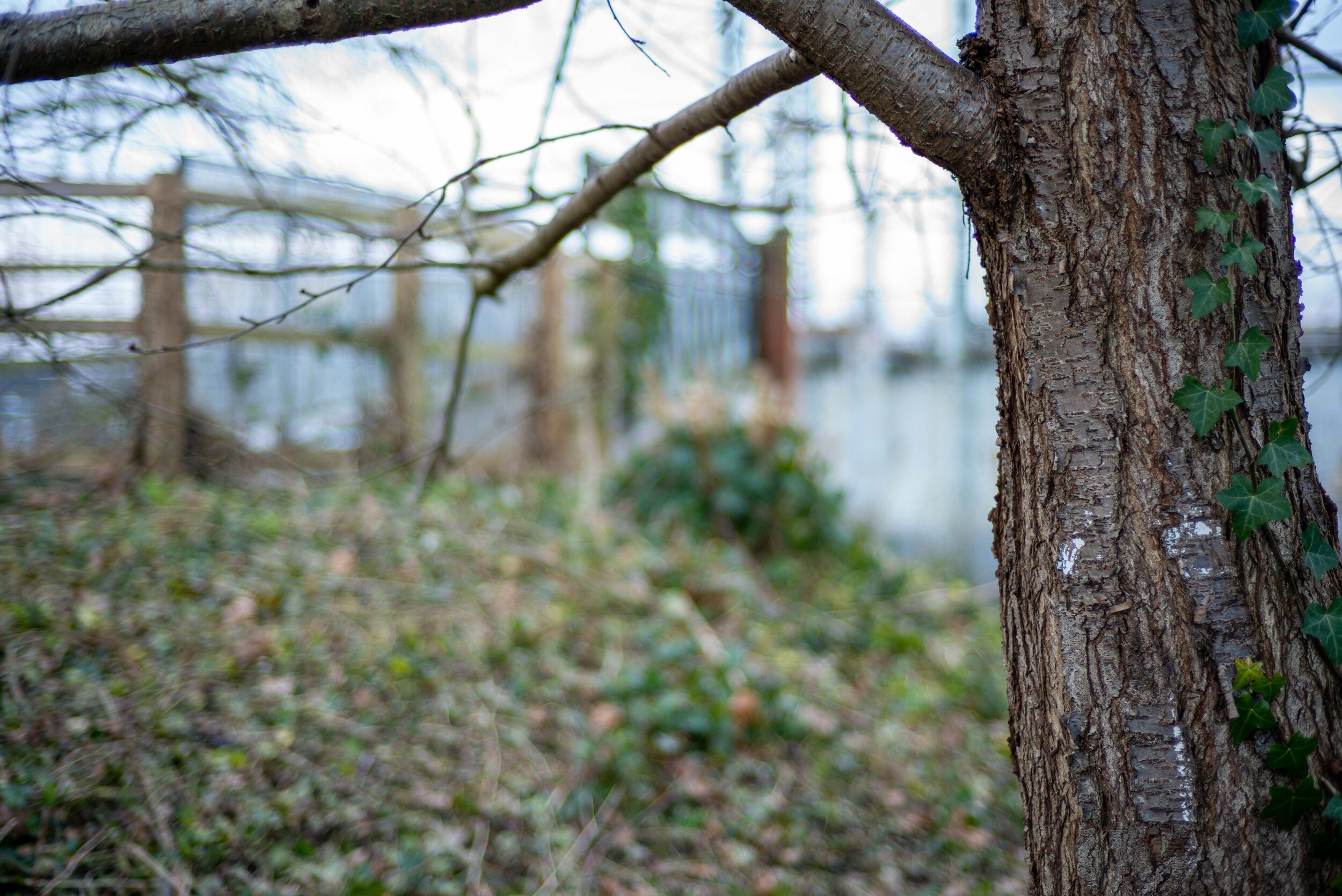
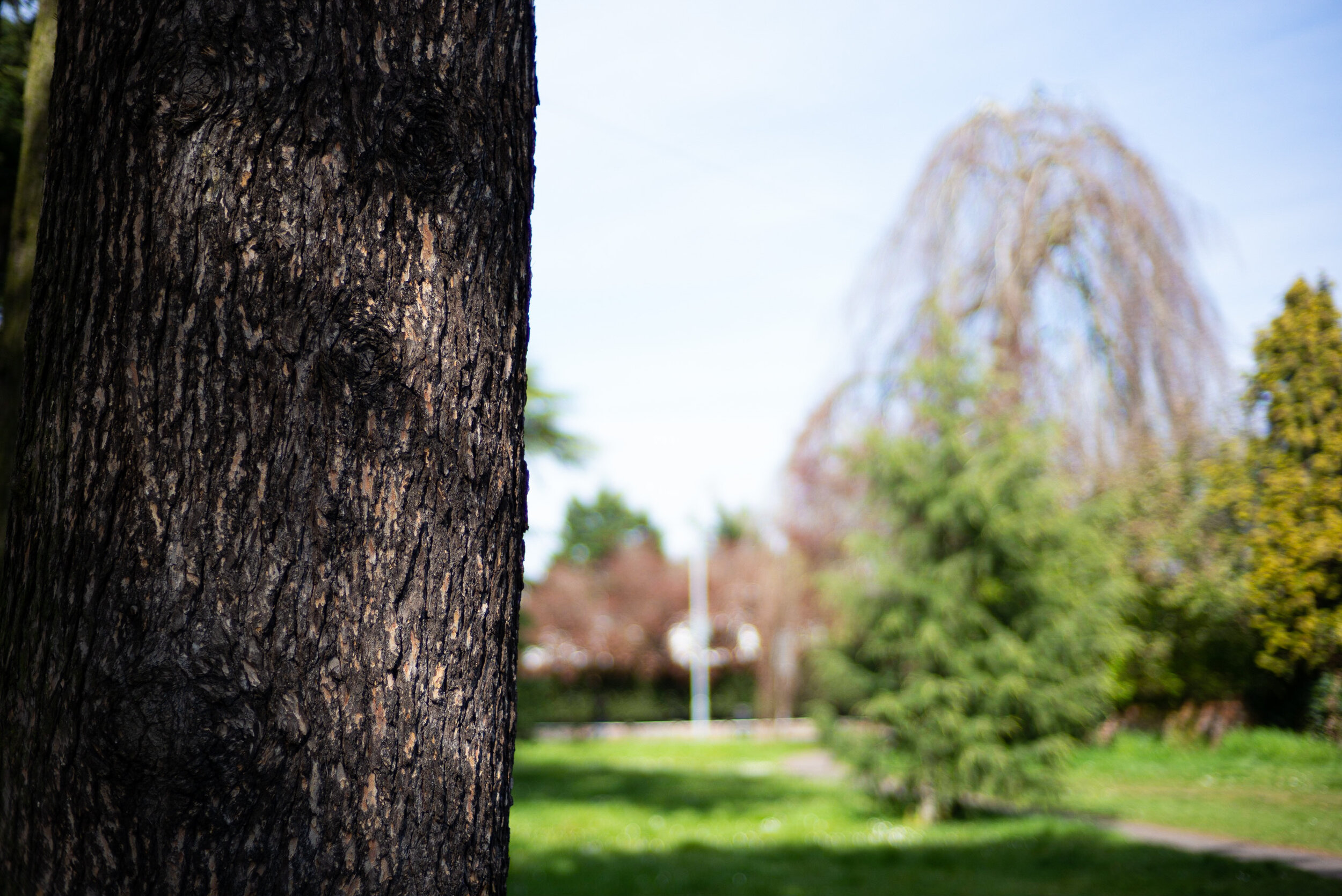
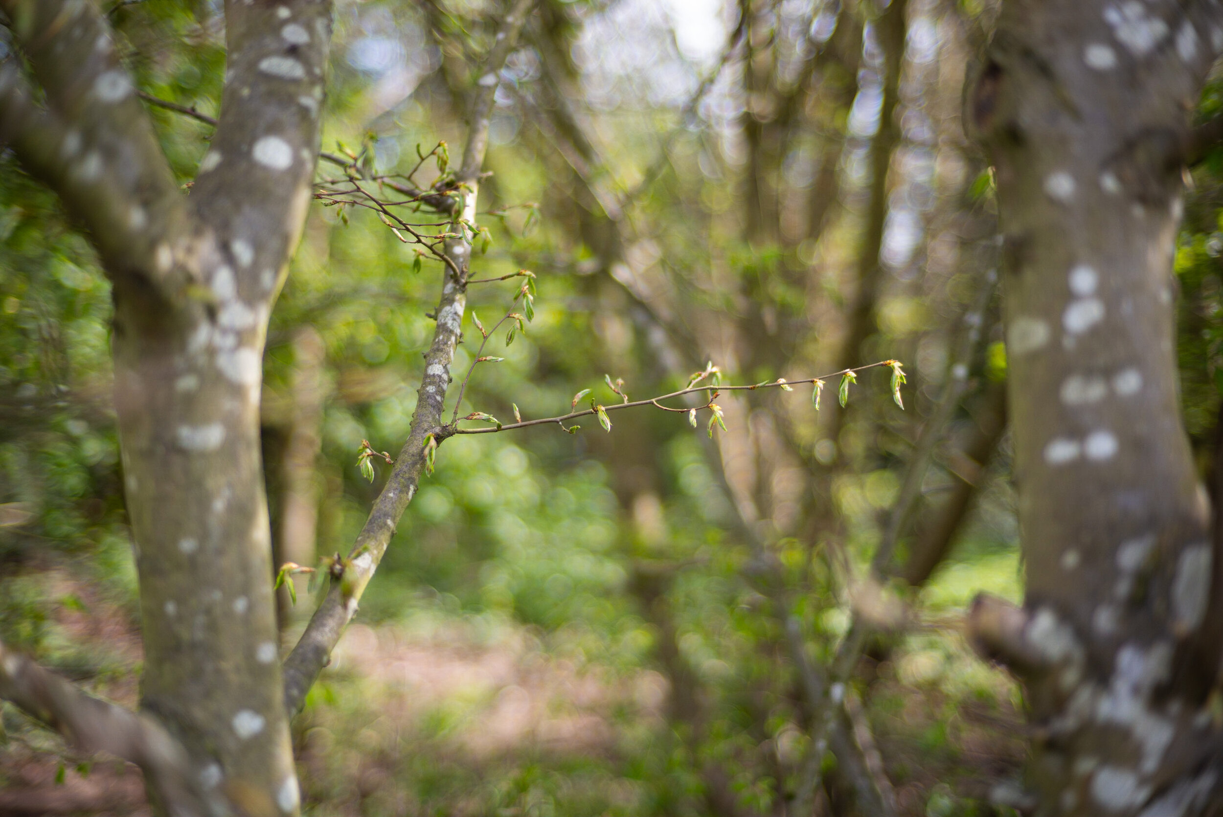
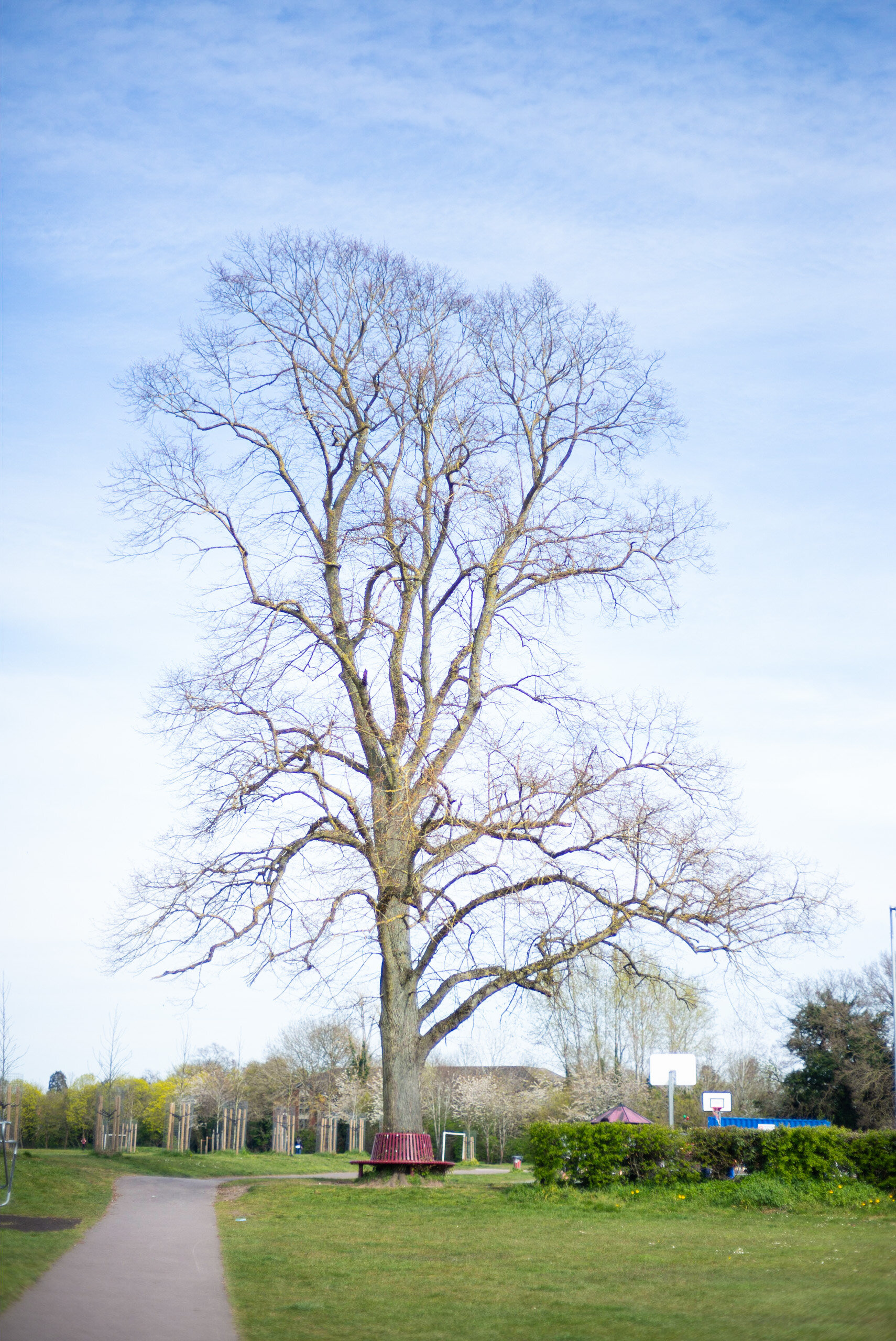
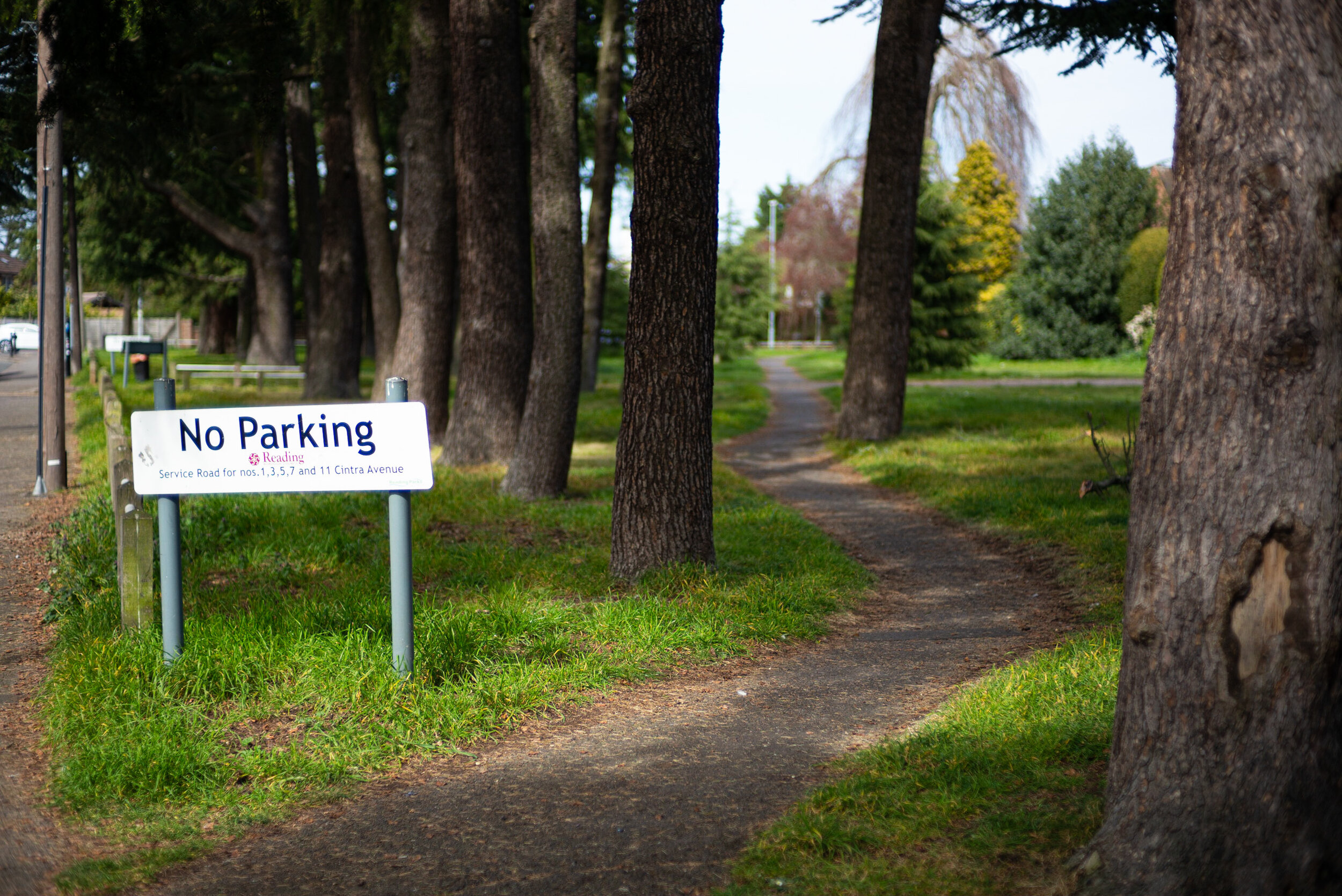
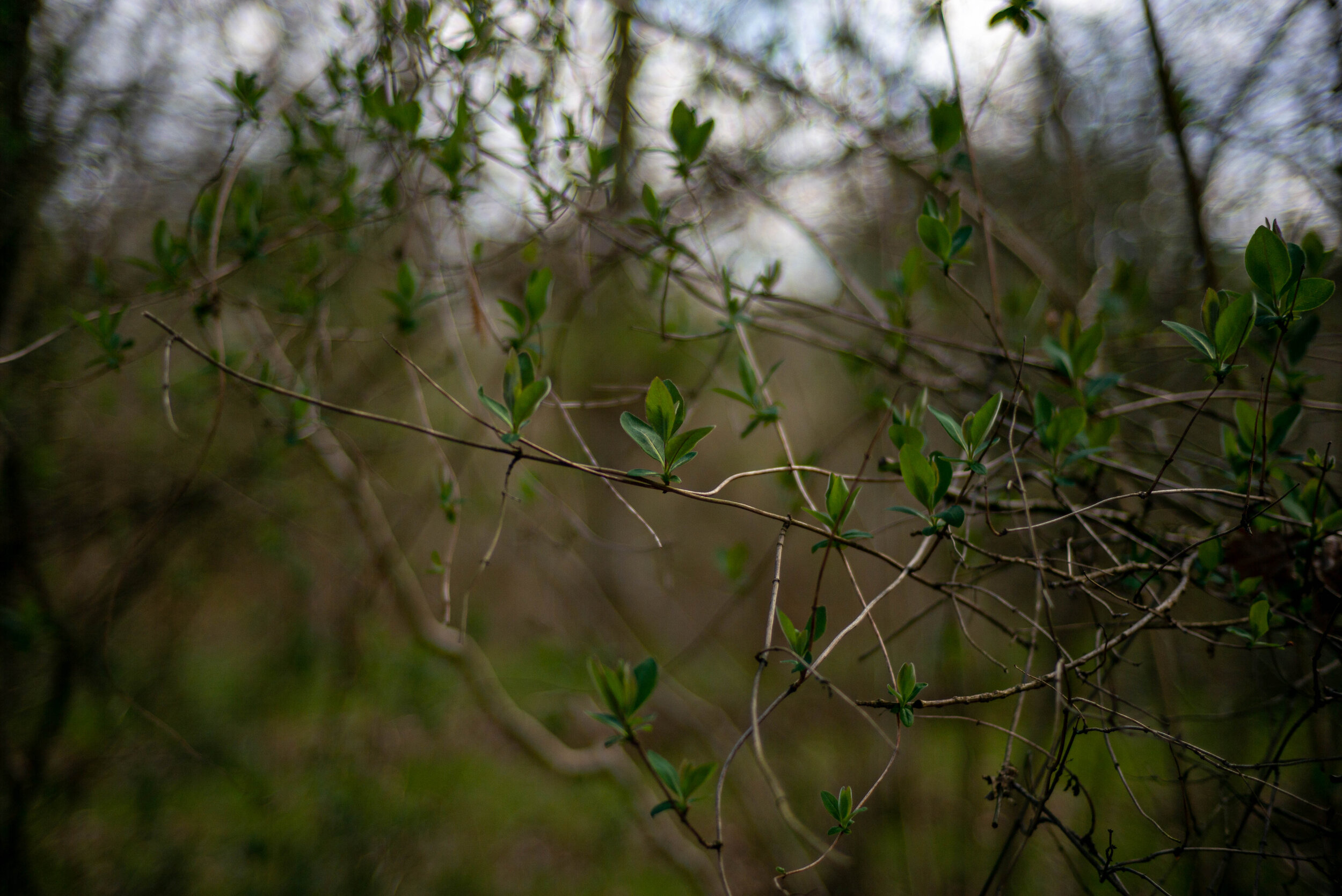
I will leave you with a few sample images: apart from Daniela’s portrait, they have been shot just to show the character wide open. No art, just geeky material!



Thanks for reading. Please let me know what you think in the comments!


